Tuesday 9 May 2017

Evaluation

End of Module Student Evaluation
BA (Hons) Illustration
Module Code: OUIL505 Illustration 2: Applied Illustration

Name:
Student ID:

Please identify where the evidence for each of the learning outcomes is within your submission and how well you feel you have met the learning outcomes. Please also grade yourself in relation to the learning outcomes using terms: poor, satisfactory, good, very good, excellent (Note- This is so that the team have an understanding of how well you feel you have done. It is not an indication of the actual grade you may receive.)

Learning Outcome
Evidenced where?
Blog, Visual Journal, Roughs, Final Illustrations, Stings, storyboards, development sheets etc.  (No more than 75 words)
Your grade
Using words:
> poor, satisfactory, good, very good, excellent
5A7:  Demonstrate an informed understanding of issues relating to media, communication, audience and context through the delivery of solutions to brief led problems or clearly identified creative concerns. (Knowledge & Understanding -  Critical Awareness)
Through evidence on my blog and my creative processes throughout the module, I have demonstrated a good understanding and awareness of the context and audience of my subject. I have also demonstrated a good delivery of resolved solutions to the problems that my individual brief had identified. Evidence on my blog also reveals that I have shown good communication to an audience that are identified by my creative concerns.
good
5A8: Understand the potential and limitations of technologies and processes used in the production of illustration for 2d, 3d and/or 4d distribution. (Knowledge & Understanding -  Research)
With my extensive experimental process that I have undertaken during this module, I have become more aware of the new potentials and possible limitations within my own individual practice. This process of developed understanding is evidenced throughout my blogs.
good

5B5: Analyse and critically evaluate the impact of social, cultural, technological and/or ethical concerns on the development of solutions to problems relevant to individual creative concerns. Cognitive Skills - Problem Analysis, Problem Solving)
I have evidence of this on my blog that my research into various themes surrounding my subject and the context that my outcomes are applied to has given me a much more informed understanding of the social, cultural and ethical concerns of my solutions and individual creative concerns. Through research into shamanic cultures I now have a more informed knowledge of my context of study which means I will have been able to solve the creative problems of my brief.
good
5C6: Explore and apply a range of appropriate practical and conceptual approaches to self-determined ideas, concepts, solutions/proposals in response to own identified intentions and relevant practices. (Practical Skills - Practical and Conceptual Development)
I have explored a wide range of appropriate conceptual and practical methods in relation to my subject of shamanism. I have also shown a good level of idea generations in response to my identified proposals that have been fully explored throughout my intensive individual relevant practices. There is evidence on my blog that show  this process of my practical skills through my practical and conceptual development.
very good
5C7: Produce technically competent and conceptually appropriate outcomes to identified problems through the selection and application of visual skills. (Practical Skills - Visual Quality and Technical Competence)
This is constantly shown throughout my blog that I have produced a very resolved and high level quality of images. I have outlined my conceptual ideas and have effectively translated them into a range of technically competent outcomes that are also demonstrated to have very effective applications to my product and real life context. This is the are of the module where I have devoted the most time and this is made clear throughout my blog.
excellent
5D5: Demonstrate the ability to plan and carry out a period of increasingly self-directed study through the appropriate use of workshop areas, studio activities and project management skills. (Key Transferable Skills - Presentation and Evaluation)
I have demonstrated a good ability to carry my initial project plan and through the process of self directed study have been able to make a very good level of transferable skills. I have also used the work shop areas such as the print room to help to identify and explore with my own practice, this is evidenced on my blogs. Management skills was a hard part of this module as the deadlines of projects were all very close but I think I have been able to keep a consistent momentum.
good


Summative Evaluation (See Evaluation Guidance on next page for more information)

You are required to write a 750 word Summative Evaluation of this module.
Please type up your Summative Evaluation in the box below. Make a PDF of the document, print out a copy to submit with your portfolio of work. Also please cut and paste the text from this box into the final page(s) of your OUIL505 Project Report.


overall I think this module has gone very well for me in many ways. At the start of this project I was unaware of many of the concepts, practices and methodologies that I now have a much better understanding of due to my time spent on researching and exploring new ideas and concepts. At the end of this project I feel much more equipped with useful knowledge that will make my practice much more well informed.

During this self directed module, I have developed a much better understanding of my contextual subject of shamanism, entheogens and psychedelia. These are all areas where my recent artwork across all modules has been inspired from, so becoming more informed within these subjects is allowing my practice to continue to develop. Also, by researching into a range of product based studios and also making mock up versions of my illustrations onto a set of sellable products, I now feel I have a much better understanding of how I can translate my artwork/screenprinting onto a range of specific items. This new acquired knowledge will become of good use for me in future projects and on my own individual practice. I have also developed and explored a new range of print based media experiments. This has been the biggest part of this module for me. I have made experiments with the layering and marbling of different colour combinations and textures. I have also explored a new range of materials and textures to print on to get a variety of new aesthetics that can lead to more well informed and refined outcomes. This process of experimenting and creating new aesthetics is really enabling me to find new, original and professional looking final images. I will be continuing to pursue this approach to new processes throughout my next modules and my own practice. Throughout this module I have been reflective on my experience throughout the use of my blog. In doing this I am able to record my own decisions so that I can be fully aware of the processes that I take and what I have learned in doing this, what I haven't enjoyed and how it can influence my practice. The use of blogs allows me to asses my own work on a more critical level which enables me to analyse my work in a higher detail to get the best and most professional outcomes.

I think a big part of making this project well informed was my constant and consistent time invested with the print studio in order to explore my own directed practice. I developed a lot of time into making and testing my outcomes which was actually the most enjoyable part of this module. I have had the most fun with the practical elements of this project and exploring new methodologies of colour, texture, shape and line through the use of extensive printing processes. Also I think another really enjoyable parts of this project was my new prints with the use of ultraviolet paints. This has really helped me to visualise a new way in which I can take my artwork of painting and screen printing to the next level. The use of UV paints allow a single image to have two aesthetics and I will continue to further study this in my own practice.

I think this project went really well but there are however some things i could have done in order to make my products more informed. I could have firstly spent more time within my sketches so that my idea and original thought processes could have been further explored before jumping right into a set aesthetic to follow for the rest of the project. Roughing and sketching more could have helped me to figure out some new possible outcomes. I could have also been a little more consistent with how I balance m time with this project. I devoted slightly to much time to the making and experimenting materials rather than applying them to products, which is what the brief is mainly about. I could have also done slightly more research into the product context of my subject and also should have attended more group crit sessions to get a wide amount of peer and tutor responses that could generate new ideas from another perspective.

 I have learnt a wide range of contextual concepts within my subject of practice and have developed new methods of image making through print, I will be taking these forward into next years studies and in my own personal practice. All of the skills I have acquired throughout this project has really made my practice become more experimental and refined that will help me to generate new ideas and concepts for myself as we'll as make much more professional outcomes that can also be applied to a wide range of sellable and commercial items.


Project report

Monday 8 May 2017

Products - Clothing

I think this could potentially be a very big part of my practice, The production of t-shirt and clothing printing. From the start of this module I have always had the idea that I would be converting my screen prints onto a a range of items of clothing. This was my primary product and is the best way for me to demonstrate how my work could look in a real life context. I have made mock ups of a range of my prints varying from full colour blends to simple two colour prints. I am trying to get a good range of possible products that could be explored in the future. In doing this I have certainly gained some new perspectives of how I can translate my work onto a list of products. The use of photoshop has really allowed me to put my ideas to life without actually having to make the clothing or products. This is a great way for me to see how it would look as a possible printed piece of clothing.


I have tried a few different prints onto white t-shits as the white thirst is a very common piece of clothing and could appeal to many people. My favourite white t-shirt mock up is this two colour skull shaman. I think the sublet hint of the aqua colour is all that is needed to make this an effective t-shirt design as well as the detail in the drawing. Its very nice go see how a pencil drawing can be completely converted into something like this. It has really shown me the potential of the whole process I have taken in order for this to happen.


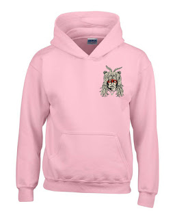
Trying to keep up with the contemporary urban trends so I have made these pink hoodie and sweater shaman designs. I actually think the design above of the pink on pink is actually really effective. The pastel background works well with the vibrant neon blend Next year when I have the opportunity to be printing more clothing, I will definitely be printing onto a range of pastels such as pink, purple, turquoise and teal. This will be keeping up with fashion trends in order to appeal to a wider range of people. These mocks ups are really helping me to fiche out the direction of my own printing practice.
The pink colour blend also works well on the grey.

This is one of my favourite clothing mock us and is probably the most convincing. The grey, white, black and blue work as a very well balanced colour pallet and the design seems to fit really well with the shape of the jumper. I have never printing my own jumpers before but after seeing this I will be pursuing it in the future. These products are allowing my practice to become much more diverse and applicable and this is perfect for an illustrator because these are all very effective ways for me to have a voice and to communicate my ideas through product and merchandise in a professional setting.


Products - Phone cases

I have decide to apply my designs onto phone cases because it is a good and easy way for an illustrator to get an illustration onto a widely bought sellable product. I think this is a perfect setting for my designs because many print studios such as the killing tree clothing and midnight mill produce a wide range of products and phone cases are a very big part of that because there is such a big target audience for them. I haven't tried to just slap my illustrations on to a random selection of products, with this task but I have thought about the context and wether or not they are applicable or worth applying to a specific selection of products. With this, less can be more and having a small section of quality products can be more effective than having a huge range of mediocre products.


I have again applied my shamans onto a wood background texture. I think it has a much nice quality to it and really reinforces the concept of shamanism. I was originally just going to put these on either black or white plastic phone cases but then realised that with the combination of the wood textures, the prints are more well informed with a much stonger aesthetical outcome.
I really like just having the shaman print in the centre of this phone case. It seems to fit very nicely with the shape of the phone and the bright white pops right out of the redwood background with a high contest making it a more defined product. Making these mock ups is actually much easier than I thought and is allowing me to see my work as a sellable item which is giving me many new ideas and ways to approach my studies during next year.
I have been trying out some different compositions that could work with these sham prints. I actually really like the outcome of this full bleed design, even though there isn't much of the wood showing through which would have been nice, this could be the most convincing phone case mock up design. When these prints are compressed into a smaller space they can seem to have more detail which is good in this way because it makes the products more professional. This design and the green jaguar above are my favourite mock ups for the phone cases, I think they are the most convincing and therefore sellable.


I have also tried some earthy tones with the aztec shaman to try and compliment the wood colours and I have also tried a really loud and vibrant print as a mock up to try and get a very high contrast between the background and the print. I think both are successful in there own way and these sample mock ups are giving me new ways to think about the context of my practice.


Products - Prints


From the start of this module, prints, or framed prints were always going to be a big part of my finished products.  This is very effective because this means that my printed images coulee be scanned in and applied to a range of products, but also with the more unique outcomes withe the varied colours and textures, I am able to have my prints as sellable items that go well with my created products. By putting them into mock up frames on photo shop, I am able to see them in the real life context. This is really helpful for me because I have never done this with any of my prints before and I think by doing this it adds another level of professionalism to the product that actually makes it a more sellable item. For my framed prints, i have chosen a range of my favourite prints on different backgrounds with different colours to see if they would all be effective in a real context. I am actually very pleased with how they look and this is making me want to frame some of my prints so they are more viable to be sold.


At first I was slightly skeptical as to how the full colour prints would look in a framed context as I thought they may look to vibrant, but I am still very happy with the full coloured prints in this product context.


I tried to keep the natural aesthetic in these framed prints and kept a wood texture in the frame.


Products - Tote bags

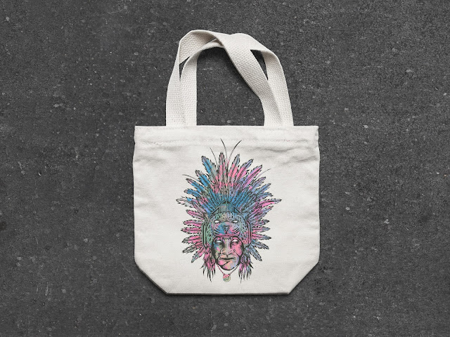
Tote bags are a very good way to make many items for cheap that can be sold to many different people. Tote bags can also be screen printed so I will be thinking about doing this in my own time and during next projects. Making layers of colour bending will be similar to paper, I just need more time to experiment with this.


I am very pleased with how these have actually turned out. When I take my prints and put them into  a new context, it really shows me how I can apply my own practice and skills as an image maker. Once in think kind of context, it really makes the product sellable which is what I am trying to achieve, I am trying to create a professional outcome so that it could be sold in a variety of shops.


I do like the full colour blends in context and on these tote bags, but I also still like the simple one colour print. It seems to have more clarity and is a much sharper image that works well with the aesthetic of the tote bag. 

I was originally not going to be using this print in my final product outcomes, as I did not think it would work so well with the set, but after seeing it on one of these bags, I have decided to use it. I think it is a more simple design to my other prints and this bear shamans has a nice shape that is very easy to apply to products and the reduced colour pallet makes it more subtle which is sometimes more appropriate. I am glad I have decided to stick with using this design because it is the most different to my other final outcomes and it is much better to have a more diverse range of products if you want to be able to sell as many as possible.

Product - Skateboards

At the start of this module, my intentions was to have this quite heavily based around the production of skateboard designing. But as this project has developed and progressed, I have thought less and less about the application of my prints onto skateboards. This is because I have done many skateboards in the past and didn't want to have to rely on them to fuel this project, so I decided to think about it with clothing and merchandise aswel. Also I haven't focused on skateboards because the the designs I have made are not that much suited to fit the shape of a deck. There isn't many ways to fit my designs onto these skateboards. So my main products for this is not decks, but clothing, prints bags and phone cases. I have however made a few mock up ideas of how some skateboards could look.


With my products, I am trying to get a more natural aesthetic so I will be using many different wood background textures. This will enhance the quality of the overall design instead of having a coloured background. The natural aesthetic is more suitable for the human context.


Ive used full colour blended shamans because I wanted these deck designs to be very vibrant. The vibrancy is what gives the prints there strength so a skateboard also needed to have this vibrancy for the same effect.

Although I don't think these designs work to great with the skateboards, I think I have gained some new ideas about how I could start to make more digital designs for skateboards. Playing around on photoshop has allowed me to figure out some new ways I can start to think about approaching deck designs which could potentially be a big part of my practice.


Printing on different texture

During this module I have been really experimental with my screen printing. I have been discovering many new ways for me to find new aesthetics which can then be put onto products. 
I have been testing the materials of which I have been printing onto, and this includes wood, different coloured paper, grey board, acetate, corrugated card, spray paint texture, hand painted space effect, dyed woo and UV paints. In doing this I have found many new ways in which I can improve on my screen printing. The different textures and media approaches are making my printing have much nicer and unique aesthetics. From this I have learnt my new skills and I have also got many more ideas about how I can take this further in next years studies.


Printing onto the plywood was easily the most difficult to print in terms of the registration. This is because the sheet of wood is slightly warped and it doesn't lay flat on the printing bed so it can move around very easily and this can become a problem when trying to line up the layers because it needs to be very precise.


The UV has been printed onto a wide range of textures to get a varied aesthetic when under black light. I wish that I had more time because I would have printed one of these UV shamans onto a t-shirt as an extra product.

Again, this simple coloured print is my second favourite print out of all of my shaman screen prints. But what makes it much nicer in my opinion is that it has been printed onto greybeard. This just makes it a much more durable print and the grey sits well with the black and white so I will be doing many more greybeard screen printing to get a nice professional outcome.


Corrugated card is a very nice texture to print onto because it can have an unpredictable outcome which can in fact turn out to be the best resolutions. My favourite print from this module has been printed onto corrugated card. I think it works especially effectively with my shamans because the rustic/weathered effects on the darker background almost make the prints have a level of authenticity to them as they are depicting ancient cultures so the weathered texture enhances the overall outcome.

I also tried printing onto some acetate. I liked the outcome of this and had ideas of layering them on different sheets but that wouldn't be very applicable to products. I tried a few different prints onto acetate and most of them ended up really messy because the ink takes up to a week to fully dry which makes it difficult to keep clean. I do think this could be further explored in future projects.

Ultraviolet shamans

I have finally made my first set of ultraviolet screen prints. I have done the same process of my usual printing but just included fluorescent paints and trying to get a very high contrast throughout the colour blends.  Printing with UV paint almost means two image are being printed in one because in normal light and in black light they are essentially two completely different image that work equally as effective, so this is getting more diverse outcomes in my work that is great for applying to sellable products.

I have been experimenting with this as much as I can and I have painted a ultraviolet space effect and then screen printed onto it but with a white layer instead of black. I am trying to bring my and quality elements and textures into my printing processes to make it more diverse and experimental to create a new original aesthetic. These types of prints would be the final product once framed. I do think this specific test onto the space effect didn't come out quite as clear as I though so maybe I will have to revisit this idea again to define it some more.


These are just the scanned versions of the uv prints so they don't look as well as they could until the black light brings them to life.


Printing these images in uv paint enables them to be put into an entirely new content that can directly be related to mysticism
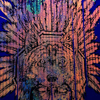
This could be my favourite print under the UV light out of all that I have made. This is because I think the bright orange tone that dominates the print really give the image a warm aesthetic and the little hits of blue, green and pink provide the marble effect with an effective balance. Another reason as to why this is my favourite uv print is because of the unique texture that runs down the entire image. This has been created because the previous print was on corrugated card which means there were parts of the print before that were imprinted onto the screen which were then transferred into this unique print. I think the texture along with the marbled effect make a very pleasing and original aesthetic that I will defiantly be exploring further in the future.

Space texture used with ultraviolet paints.

This was the space effect I have painted using uv paints. There is so much more depth created when under the black light, the painting is really given a new aesthetic which adds to the mystical contact of the shamanic culture. I want to be making more of these now I know the possible outcome. I will even be adding these uv space textures onto my skateboards. 
I also really like how this print onto corrugated card has turned out under the uv bulb. I think this one is much more subtle but is still just as effective. The orange works very effectively with the brown tones of the card (which is much more noticeable in person). The colour blend/marble effect that I have been practicing seems to work perfectly with the uv. Th colours are made much more vibrant so there is such a high contract created in the marble which i this looks very effective. I will definitely be making these uv prints and combining them with textures in the future.


New textures that are made through printing onto card is really noticeable under the fluorescent light. It is a really unique texture and I will be continuing to push this further in my own practice, giving my work a whole new level of aesthetic qualities.

This is really showing how the marbled effects can be used to created really nice textures beneath the shamans that work eve more effectively under the black light. 

 I tried some new approaches with this print. I have printed the shaman in reverse, so it has been printed on black card and for the usual black layer, I have used a range of neon paints as a marbled effect. This creates a different aesthetic to my other prints, But I think that this one is probably the most effective UV print because it is the most clear what the image is and the colours seem to work very well and have a really fluorescent glow. This is also one of my favourite experimental ultraviolet prints and I will defiantly be making more with the use of this very interesting media.