Showing posts with label OUIL 503 Responsive. Show all posts

Thursday, 27 April 2017

End of module self evaluation

Learning Outcome
Evidenced where?
Blog, Visual Journal, Roughs, Final Illustrations, Storyboards, Development Sheets etc.  (No more than 75 words)
Your grade
Using words:
> poor, satisfactory, good, very good, excellent
5A4:  Make appropriate use of a range of research methods to investigate a topic and produce work relating to the critical, cultural or social context of art and design. (Knowledge & Understanding - Research and Critical Awareness)
Throughout this module my process of research has been more explored within my own practice. I have investigated a range of aesthetics that has helped me to acquire a new set of methods of image making. This module has also given me the freedom to explore my own contextual relation which has driven me to the similar concept of psychedelia running through my imagery which is where I would like I take my personal practice. This ongoing concept is evidenced on my blog.
Satisfactory


5B3: Generate ideas, concepts, proposals, solutions and/or arguments using the language,
materials, processes and techniques of a designated discipline. (Cognitive Skills - Problem
Analysis, Problem Solving)
Through evidence on my blog I have repeatedly shown that my idea generation is primarily explored through the roughs. I also have generated ideas for myself by using experiments of techniques and materials. These explored processes help my work to become more well informed and visually refined and has given me the ability to produce a various range of outcomes, making my practice more flexible. These processes of my development are evidenced throughout my blog
Very good
5C3: Respond to set briefs or proposals in a professional context. (Practical Skills - Visual Quality and Conceptual Development)
I think that my finalized outcomes for this module outline the ongoing sense of professionalism within my practice. This gradual progression of professionalism is evidenced through the use of blogs. I feel that the beach buggy brief has really started to show me how my practice can be translated into a professional context. Craftsmanship and attention to making highly refined imagery has also allowed my work to better suit a professional context and this is evidenced on my blog.
Excellent
5D3: Exercise self-management skills in managing their workloads and meeting deadlines/apply interpersonal and social skills to interact with others. (Key Transferable Skills, Organisation, Communication and Evaluation)
Self and time management has been one of the difficult parts of this module. This is because the briefs are all running at the same time and it can be hard to know what project to work on and how much time to devote. I think that I have created a substantial amount of physical work for the briefs but I think I may have left some of the written elements to the later stages of the module rather than being consistent.                                                                                                                                                                                    
Satisfactory

Summative Evaluation (See Evaluation Guidance on next page for more information)

You are required to write a 750 word Summative Evaluation of this module.
Please type up your Summative Evaluation in the box below. Make a PDF of the document and post the PDF as your final post on your OUIL503 blog. Also, please cut and paste the text from this box into the final page(s) of your OUIL503 Project Report.


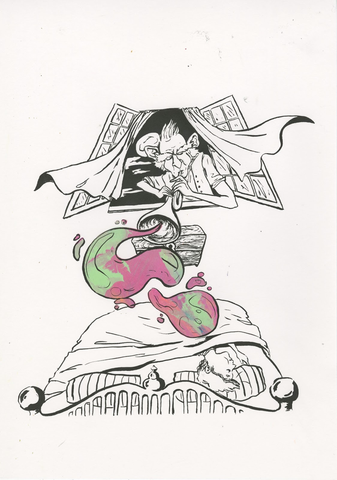
I feel that this module as a whole has been a very valuable and beneficial experience. I have gained a new range of new methods and disciplines related to image making that will really help to push my own creative practice further and into the professional world. At the start of this module I think that I may have lacked certain aspects of confidence within my practice and own abilities but I have now discovered new styles and approaches I can further develop that will make me a more diverse and flexible practitioner. Some new skills that I have acquired during this time is the use of line and pattern to create a detailed piece of psychedelic imagery. I have also found a new level of confidence from the beach buggy brief as I had to challenge myself and push my sense of perfectionism in a looser manor in order to create an original design. I have also developed my use of color within the process of screen-printing. Screen-printing is an area of image production that I have been recently exploring and developing across all my modules but within these briefs I have further explored my sense of vibrant and multicolored marbled effects to create unique aesthetics that can be applied to a wide range of images and potential products. Spray-paint is another new media format in which I have explored in this module, this was a very enjoyable experience for me and I think that it has opened many new doors for me to apply what I have learned to new projects. With the explored media of spray-paint it has made me think of my own work on a much larger scale and in my own practice I am thinking of creating some mural sized psychedelic pieces that will be done using a range of spray-paints and paint pens to get a very vibrant and graphic finish. I will pursue this further during summer.

My favorite outcome from this module is the beach buggy psychedelic pattern design, this is because during this brief I have developed a new style, created a new aesthetic and have been challenged by being put out of my comfort zone. I have also had a good chance to see my work in a professional and real life context which has now given me a new sense of direction in my own practice that I feel could one day be successful.

I think if I was to go back and change a few elements of how I approached this module I would have devoted more time into my contextual research. I realize that if my research had been more thorough throughout the briefs then my roughs, development and final outcomes would have been more well informed meaning they could have been produced with more of a contextual basis that have strong powers of communication. Another factor of this module that could been improved is my ability to divide equal amounts of time through the running briefs, there was times of this module where I wasn’t balancing my time effectively and this may be due to the fact that there is a lot of independency in this module. I also think I could have been more consistently reflective on my blogs so that my development is regularly discussed that will reinforce my reasons behind my decision making that will potentially help my project to expand.

I think that the most valuable part of this project for me is how I am going to take the new set of skills that I have acquired during the briefs and continue to further explore and develop them within my own personal professional practice. This has almost been a turning point in how I am now thinking about my future as an artist and the decisions and actions that I can take that will push my success. I’m aiming to go beyond just making illustrations onto paper and ive got ideas of how I can translate my artwork onto a variety of objects and products that will essentially elevate the value of the artwork.

Another way in which I have solidified these new ideas for myself is by getting help and advice from peers and tutors throughout the briefs that has helped me to generate new ideas as well as expand on my existing concepts. Concept has been a big part pf this module for me as I have had the same ongoing theme of psychedelia running throughout my projects and this is because my aim as an artist is to be known for making work within this trippy subject. I feel that it is what kind of art I am most motivated to pursue and it also gets the best response from my viewers so this concept will be further explored throughout my contextual and physical practices.


Project report

Collaboration design boards

Beach buggy design boards

Nottingham post brief design boards

Decks for change design boards

Monday, 24 April 2017

Beach buggy collaboration - Progression and final outcome

After doing my roughs and looked at some reference for some designs I thought I was ready to start. I thought that I would be following the basic composition of one of my roughs but just before I started to doodle I had a sudden thought that changed it all. I literally scrapped off all of my existing designs and i chose not to look at the reference images i had, I just started to freestyle the entire thing and just let the randomness create the unique aesthetic and to not be too controlling with the lines and shapes.
At the start of drawing on this car I was incredibly nervous about putting lines onto the buggy. This is because my friend chad had spent nearly 8 days working on this car and getting it ready for my artwork so if I messed up or made any mistakes it could mean that he would have to respray the buggy to cover up my mistakes. There was really no margin for error with this because the pen could not be rubbed off once applied so I had to just build up the courage and go for it. After I had stared going with the drawing it seemed to get easier and easier as I was getting more and more confident with my own abilities. I have take some progress pictures so you can see how it all builds up into the finalised design.

This was the back end of the buggy, again I was just 100% freestlying this design and just going with what felt right at the time, I would usually fully plan a final piece like this but something at the time just made me express my shapes and patterns in a completely random and spontaneous way. In doing this I had basically made a new style for me to work in and I had surprised myself with what could be achieved with a little confidence.

The whole buggy design took me 7 hours of complete drawing time to complete. I only had one day to do this so I had to be as efficient as possible.

finished front strip of the buggy

Finished back strip of the buggy


Out of all of the things that I have produced for the responsive module, this is my favourite. Firstly because I have never drawn on anything like a car before so having this as my canvas makes it alot more of an exciting piece of artwork. I also think this could be a big step in my own personal practice and I am adding to the list of possible ways that I can utilize my artwork onto a range of products and items. I think I will be getting more clients like this wanting similar things on cars in the future. The owner of this buggy actually owns 150 cars and he said to me that he would love for me to work on more of them. I have also had the most fun in doing this and the fact that it was a big challenge for me makes the final outcome more of an achievement. After doing this I now have a new style developed which is like a psychedelic tribal pattern and I also have a better sense of confidence as well as more idea of how I can pursue  career as an artist. So overall this has been a very fun and productive experience.

Beach buggy collaboration - Before drawing

This this the buggy in the stage where my friend has sprayed it white so it is now ready for my part of the project which is to simply add the pattern onto the buggy in the sectioned areas. 
The strip will run through from the front right to the back end off the vehicle, almost like a racing stripe made from pattern. This was the wishes of the client so I needed to meet his specific needs of the aesthetic of the designs, other than that he said that it was pretty open for me to explore my own unique style onto the car.


Beach buggy collaboration - designs

To get an idea of the basic composition of the design ive just started to sketch down some possible patterns.


My aim is to just make the patterns out of basic lines dots and shapes.
The client wanted the pattern to be just black and white so I don't have to think about colour for this which is quite a nice relief as i've done a lot with colour recently so it will be nice to strip it all back to just the contrasting colours of black and white.
Ive had an idea of having it very symmetrical looking almost like a mandala emerging out of the centre petrol cap.

Once I had the idea of doing it in a symmetrical design, I immediately rethought and changed my mind because it will make it much harder ti make the patterns with symmetry and if they are slightly out of line it will make it look wonky and I wont be happy with that. So my idea is too just approach it very loosely and be quite free and expressive with the shapes rather than having it all mirrored.

I want to include some possible subtle images that help the shapes work well. I could maybe include some peace/yin yang symbols as this would work well with the black and white theme, I could also include some eye balls. Just some small object to break up the patterns could really enhance the overall aesthetic of the design.

Beach buggy collaboration - Reference

After speaking to the owner of the buggy (the person who's car im drawing on) we ran through a few possible ideas of what sort of patter could be included onto the car and where abouts the patters could be included. After talking it through and looking at some images on the internet of existing car pattern designs, the client sent me these images as a reference to how he wanted his to look. After seeing these I had a better idea of how to approach the design and now I could start sketching some rough ideas down.


Beach boggy collaboration

My friend has his own business spraying and refurbishing cars and motorbikes. One of his clients asked him to fully spray paint and renew this old style beach buggy. He also wanted someone to hand draw a pattern design onto the buggy so my friend recommended that I could draw onto this buggy once it had been sprayed and refurbished. After my friend told me about this project I was instantly up for the job. The idea of having a car for a canvas seemed like a perfect way for me to push my abilities and put my artwork onto something that i have never done before. I knew this wouldnt be an easy task but I was up for the job.

This is how the buggy looked before it had been spray painted. The idea was for me to draw on the section of the buggy that has been masked in the picture.

collaboration roald dahl final prints


This was my favourite final print for the Bfg scene. It is my favourite because it has the most unique colour blend with the highest contrast of colours. The bright oranges and yellows work effectively with the darker purple and greens. I think the multicolours of the colour blend gives the impression of the dream being blown pretty effectively, I wanted to show the dream bubble with a swirl of variated colours. Screenwriting can give a very unique aesthetic that works well with what I was trying to achieve with the visual aesthetics of this print. As an image however I think it is still a little empty and could have been slightly more considered maybe with including the inside of the bedroom.

More prints of the Bfg, what I like about screenprintnig with the marble effect is that they all come out unique so you can choose the most effective, also the group gets to each have a print each.
My favourite part about this print is the yellow and orange highlights on the faces of the characters, it really gives the impression that the fire is a glowing source of light. I also think the added black helps to define the characters. 

I tried to get a combination of peachy colours within this print. The orange pink and yellow tones make a convincing peach texture.


This collaboration brief I have to say that it has been interesting working on a group project as this is the first time i've ever had to do this. It has shown me how possible collaboration projects would be approached in the future and how a group can create an image rather than an individual. I was slightly disappointed that I couldn't do any of the design work for these images and only printed them and added colour but I have also learned that in group projects people have to make certain sacrifices in order to make a collected image.


Tuesday, 18 April 2017

Collaboration - Making print positives

As my role in this collaborative project was not to design the images and is just to be the printer, I had to wait for all the designs to be drawn up before I could create the positives for screen printing. 
We had all decided as a group that we would have a design of james and the peach on top of the empire state building, the witches and the fire scene and the Bfg blowing his dreams into children's minds. We wanted for each scene to be a direct scene from each book to make it more authentic and fitted to the dialogue of the book.


The two images above are two of the three final drawn and inked versions of what was to be printed. After I was given these for printing I made a decision to take the inking further, although this was not part of my role I still voiced to the group that the images would need more black areas to really make the characters in the images stand out more rather than just being blurred by the liney aesthetic, and with more black areas it would make the image more suited to be screen printed. After I said this would make the images stand out more, my group was happy for me to add ore black to the positives in order to enhance them.


These are the images now they have been darkened in certain areas to add more depth and clarity to them. I felt like before there was a little confusion with all the line work so it needed separation with some darker shapes. After doing this I then showed the group the slight changes I have made and they all agreed that this made the images better. So the black layer is now ready for printing, I just need to make the colour layer for each design.
Although I wasn't the one drawing these designs, I made it clear that there needed to be a big area within each image that is significant to the story\character, and within this area would be a marbled colour blend. For the witches the colour would be the fire, James would have a colour blended peach and the Bfg would be blowing a colour blended dream out of his trumpet. Now the positives for both layers are complete, it is now ready for the final stage.

Monday, 17 April 2017

Collaboration Roald Dahl - Development sketches


After reading the Roald Dahl brief, I knew that this was going to be one that I would start designing for. I initially thought that I would be just character designing on my own but after the big collaboration day we had and I spoke to a few individuals, we had decided that this was going to be the brief that we were to collaborate on as all of us wanted to do some character design work for a childhood story. 

We had a group meeting on how we would go about making these characters and what stories we would choose to produce work for. We all agreed that the BFG and the giants would be a good one to start designing characters for, we also liked the idea of doing the witches, fantastic fox and james and the giant peach as there had to be a villain a fantastical character and a child within these designs. 

I stated to design some characters for Bfg and the giants, just trying to get a range of different possibilities that could work as children storybook illustrations. At this moment we are all working on ur own drawing styles to create some characters so in our next meeting we can decide the things we want to take into further development and leave behind the things we don't need .

More giant concept designs. I had an idea of playing around with the scale of the characters, I like the idea of the giants being much much larger than the bfg to really add a scarier element to them. Being the villains I am trying to make them quite dark and scary looking. I feel like this would add more character to them.


Ive tried playing around with some possible colour tests for the Bfg using inks. I realise that colour will be a very important part of these characters and they can't be just black and white so thinking about colour possibilities is an essential part of this project. If the Bfg was to have colour included I think more earthy tones would be more appropriate.

I had a quick idea of including my space effect into the scenes, it would be a good way for them to work as a set as there needs to be something consistent that connects the designs so they are not just three random scenes. Because there are four of us working on this we all need to have an equal amount of input into these designs so atlas one person needs to add the colour and that could possibly be my job, putting the hint of colour into each scene while others draw and ink them.


I had a quick idea of making the giants all out of silhouettes with white eyes so they all look very similar, this could add to the eeriness of them, especially when in a group, I quite like this concept piece and I think it is very different to what I would usually make, but at he same time it would be difficult to keep this same theme running throughout the three stories. 

After another group session and discussion, we have decided that we would do Bfg as the fantastical character, the witches as the villain and James for the child. The decision was for everyone to keep sketching and designing the characters now we knew for definite which stories/characters we would illustrate. 

The next step for me was to start drawing some witches. I am always usually drawn to making my characters quite dark and creepy looking so having a go at some concert designs are perfect for me.

Ive started drawing some classic looking witches in some various styles. Im trying to get as manny different possible variations so the group would have more options to choose from.

The witches I have drawn here work as a concept sketch but I'm not sure if they would work too well for a children's book. I think they will need more colour and to be toned down slightly and maybe have more shape/textures involved rather than being completely made of lines.

I find it very difficult to make sort of watered down and charming looking characters, mine always end up being slightly sinister looking so I think I may not be the person who is going to be drawing the characters up and I will have to have some other form of input, possibly the colour.

After another group meeting we have now decided on who is going to have what role with creating these characters ad scenes. We decided that I won't be drawing the characters as my style may not be suited to the brief so it is left in some more capable hands. We had decided that one person would design the layout for the scenes and how they would be composed, someone else would draw up the characters and the scenery another would ink and then my role for this is that I will be screen printing the final designs and adding the colour. I will be adding a marbled effect to each of the scenes so that they look they they are made from a consistent set. Now I have to wait for the other group members to draw and ink the designs so then I can take them forward to be finalised and printed.