Showing posts with label OUIL 403 Visual Skills. Show all posts

Monday, 16 November 2015

End of module self evaluation

End of module self-evaluation
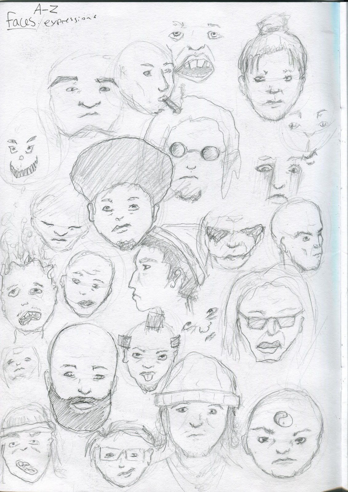
Firstly I believe that my practical drawing skills have increased in quality over the course of this module, this is due to the way in which I have been using my sketchbooks with sketches and roughs. These methods of working quickly has really elevated my final outcomes. Also this module has really helped me think about my drawings in more depth in terms of how my work can translate a message or meaning in an effective way. Each brief within this module has encouraged me to think outside the box and this has impacted my own practice which has made me think more about the meaning of an illustration and not just its aesthetics.
One of the most helpful and fundamental theories of image making that I have learned during this module (especially in the second brief) is the power of minimalism. Stripping an image down and excluding all of the unnecessary features can create a simple but functional illustration and can also translate a powerful message that many people across different cultures can understand. I aim to try and create some of my own work around this idea of simple and effective.
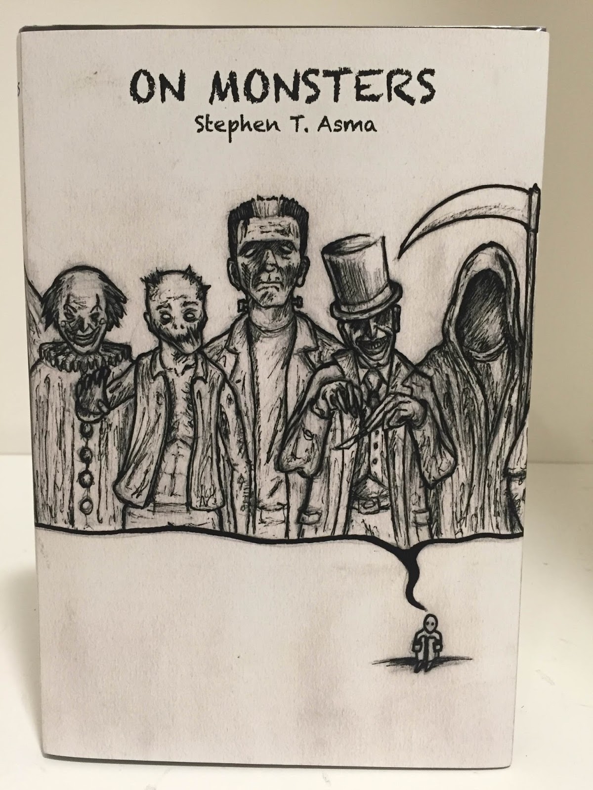
Over this module it is clear that my strengths are working with traditional media such as pen and pencil. They are my preferred choice of producing illustration and I have used this method throughout the module as I know it is my strongest attribute. The areas I have identified for further development is that I need to start to widen my colour pallet, at the moment all of my pieces have been monochrome. Although I do really enjoy working in this way I have to also consider other possibilities of mark-making. I also feel that for future projects I need to be able to produce more digital work, at least learn digital skills so I can digitally manipulate a drawing to enhance the line quality or add colour. After seeing how some classmate’s work I have realised that I do need to step outside the box with my use of media, this will really help me on my path of becoming a more professional illustrator.

This module has really given me a good introduction to the course and how I will be producing work over the next three years. I know I will also develop a much deeper understanding of illustration and how it can have an impact on people across the world whilst preparing myself for the competitive industry. The briefs that were set over this module have already put me into a better way of thinking and producing illustration so this can only continue to happen and will be shown throughout my work.

Sunday, 15 November 2015

Do judge a book by its cover (Final and Evaluation)

Completed design of wrap around book cover
This is the unedited version of my final book cover design.
This is the Photoshopped version of my book cover with type included and adjustments to the levels and contrast to make a more professional and convincing outcome.


Final book cover design wrapped around existing book, edited and printed.


EVALUATION

In my opinion this has been the best project so far. I think I made a good decision on which book to design a cover for as it gave me the opportunity to draw a wide range of characters in the realm of monsters. The core concept of the book 'On Monsters' is about the fears and monsters that we create in our own mind and how society and culture can shape and manipulate our perception of the unknown. This as a concept is quite abstract and at first was difficult to imagine a book cover that represents this idea, however through the process of producing roughs and research I was able to bring together my own ideas. I have found that sketching as many roughs as possible is a very effective way to work out the best design composition for any piece of illustration. I was very pleased with my final design and I enjoyed every moment of producing it. For this design I think it was best for me to stick to my most comfortable media and used a range of pens to complete this cover. I did however in my last evaluation suggest experimenting different media but I think the black and white represents the concept well. If i were to go back and change any part of my final design I think it would be to use a brush pen and not fine-liners when adding ink to the drawing, this is because I have found that using fine-liners it is easy to make a drawing look quite flat and static as the line thickness does not vary where as using a brush the lines become more unique and organic.

Friday, 13 November 2015

Do judge a book by its cover (Further development)

Character research and development
Out of all the roughs I designed for the book cover, this concept was my favourite. I feel like it represents the book in the best way and had the most positive responses from peers during a group critique session of our initial ideas. That session was particularly helpful for me as the idea of the history of monsters in a police line up was a good idea, but it diverted from the core concept of the book. I then developed the ideas of the police line up and the concept that shows that monsters are all in your head and merged them together, so the monsters will all be inside a thought bubble. The outcome was the rough in the image above. After doing this I knew this was going to be the idea I will finalise and resolve.
Satan/The Devil
The character satan is mentioned in the book I am illustrating as one of the most iconic and infamous monsters of all time. For this reason I thought it would be appropriate to include him in my line up of the history of monsters. I then decided to sketch out a few different designs to try and figure out which style of the Devil will look best in my cover. 
Clown Image
After drawing so many clown in my visual language tasks, I thought it would be quite suited that I included one in my monster line up. A clown may not be the stereotypical monster but a section of the book 'On Monsters' is all about serial killers. Over time the idea of a clown has changed and due to the clown serial killers that occurred in America, clowns now have very dark and sinister connotations and because of this, I I'm including a clown to my line up of monsters.
Jack the Ripper

Speaking of serial killers, this is one of the most famous due to the fact that he was never caught. As there is a large section of real life human monsters (serial killers) in my book, I think Jack the Ripper is the perfect character to include. I really like the way he has been portraid with the top hat and blade as it created a very sinister atmosphere on the page. I have sketched down a few concepts for his design to see which angle and shape will work best in my line up.
Grim Reaper
The Grim Reaper. He is the image of death. In my opinion he is the ultimate monster. From the second I has the idea of the monster line up, the Grim Reaper had a guaranteed place. I really like the sense of mysteriousness you get from looking at the reaper, the hooded figure and a scythe is known throughout  the world and therefore makes a perfect character for my book cover. Again I have explored  few different shapes and designs to find the best outcome for the cover.  
I have also chosen to include some classic pop culture monsters to my line up such as Dracula, Frankenstein and Zombies. I have done this because the book is about the history of monsters and how they have changed throughout time. Pop culture classic monsters have had a big impact on our view of monsters so I thought it would be a good idea to include iconic characters that people can relate to, because if an illustration is relatable, more people will generally like it.


Tuesday, 10 November 2015

Do judge a book by its cover (Roughs)

 For this brief, we were told to select a book from a specific section of the library, briefly analyse its content and design/illustrate a wrap around cover in any way we can communicate the content of the book in an illustrated form. The book I chose is called 'On Monsters, An unnatural history of our worst fears' by Steven T. Asma. "Real or imagined, literal or metaphorical, monsters have exerted a dread fascination on the human mind for centuries, we cannot help looking under the bed and in the closet, equally compelled and repelled by what we most fear to find lurking there." I was immediately drawn to this book and have been very excited about creating images based on its context. After reading a couple of pages I have realised that the word monster can be interprated in many different ways and is not just seen as the iconic hairy beast with big teeth and claws. No, the idea of a monster can actually go much deeper than that, such as real life monsters like serial killers. Monsters even go back to biblical times with Satan and his demons, and can even be touched on the idea that many monsters that exist, only exist within our own minds and are a representation of our deepest anxieties and vulnerabilities. 

John kenn's Sticky Monsters. I have found this artist who produces illustrations of monsters but is done within the concept of children's nightmares. I really like the way in which these sinister characters are created, they are quite simple but very effective, I will consider this artist when producing my own monsters.

SKETCHBOOK ROUGHS


 I quite like the idea of using pop culture monsters within the book cover as main point in the book 'On Monsters' is about how the idea of monsters have changed throughout time and how certain cultures can creates its own monsters in society. Classic pop culture monsters such as Dracula and Frankenstein have had a big impact on the westernised view of the iconic monster, and as a visual communicator it is always good to produce illustrations that people can relate to.

The aim of the first week of this brief was to design and create five roughs to scale of the book cover, all being approached in different ways. This for me has been a good week because I like having the freedom to be able to generate lots of ideas and its also good to see how each idea can really develop just buy continuing to draw and experiment.

ROUGHS TO SCALE

 This rough design was generated within the idea that monsters are just a figment of our imagination (nightmares). There is a lot that can be done with this concept and I will continue to explore it though the duration of this brief.
Iconic hairy monster with big claws and teeth. 
There is a big section on the book about the future of human fears and the apocalypse. From this I created a zombie scene that runs full bleed over the whole double spread. I honestly do like this design as the zombies have been built in layers of perspective which gives a good sense of depth. But this idea doesn't represent the book as a concept so I may not develop this idea further.

 This is my favourite design so far. I have taken the same layout as the zombie scene and changed the characters to existing monsters throughout time, including Satan, Dracula, Jack the Ripper, Jigsaw and even a monster from John Kenns Sticky monsters that I have mentioned previously. I think this idea represents the book a lot better although I do need to develop this idea further and maybe add more layers and characters to it.
 For my last rough I decided to take a minimal approach, stripping down all of the unnecessary features and keeping it simple and functional. I actually do like this design and I love producing minimalistic work as I like to be able to communicate and idea in an instant, but for this book I am illustrating, I think the design above will be more effective. 


Wednesday, 4 November 2015

Studio Brief 2 - Day in the Life - Final and Evaluation

Final design - dimensions (105mm x 200mm). The article talks about how we need to get back in tough with nature and that certain people are doing all they can to make this happen. I have tried to illustrate this concept by showing a hand touching a tree.

Final design - dimensions (200mm x 200mm). Out of all the images I produced I thnk this one has the strongest concept. The idea behind the image is that the bond between nature and humans has been almost completely severed and we have the power to reconnect this bond if we act immediately. The image clearly represents this idea as the rope that the human is holding that connects to the tree is on its last fiber.

Final design - dimensions (290mm x 105mm). Of the three images that i produced for the article i would say that this one is the least successful. The image is trying to show that we are rebuilding a bridge back to nature but I think it has been poorley executed. The drawing was rushed and this was due to time management, in the future I will not let this happen.
Final designs produced as a set. I have created the images all in a similar style so that they would work together when produced as a set.


EVALUATION

Overall I think that the final outcome was somewhat successful. I was pleased with two of my designs for the article and not so happy with my third. If there is one thing I have learned from this brief, it is that these types of images must be functional, meaning that they have a purpose behind it and they comunicate a direct idea. In the past I havent usually worked around these kind of ideas so at first it was quite difficult to represent the article with a functional image. Also i tried to keep the designs very minimalistic, meaning that I didnt try to over complicate the drawings and add unnecessary amounts of detail. Sometimes, comunication through image is most effective when kept simple. This was difficult for me because at times as I tend to spend alot of time working on the details of a drawing. One thing that really did help me get the ideas for the concept was the use of 'roughs'. Using roughs really helped me visualise the image and this gave me the ability to then further develop the idea. Roughs are an essential part of a designers progress so I will be using them much more in the future. If I could change anyhting about the final outcomes it would be that I use a bold grey tone to add more depth to the images without over complicating them.


Tuesday, 3 November 2015

Studio Brief 2 - Day in the Life

For this brief we was each given a specific article that we had to illustrate three times, each on different formats and dimensions (200mm x 200mm - 105mm x 200mm (portrait) and 290mm x 105mm (landscape)). The article I was given was about reintroducing the connection with nature and wildlife within the UK. The aim of this brief is not to produce a higly detailed image but is about creating a minimal and functional piece of illustration that can send a clear message to the viewer that directly responds to the article. This brief has proven to be quite difficult as this contempory way of illustration is not how I would usually work, so I was outside my comfort zone.

 ROUGHS AND IDEA GENERATION
Roughs are quick sketches of the idea that represents the article. For this breif I feel that the roughs have really helped develop my ideas because with roughs you can visualise the drawing. This can be very helpful because once the initial idea is down on paper, I can then decide if I dont like the idea or if i can continue to develop it by making alterations to certain aspects such as the composition.

A difficult part of this brief is that each image must be presented in a different format and not every design was suited to fit the frame. This means I was made to produce more and more roughs for each format to try and figure out which design communicated the concept of the article in a minimalistic and functional way.
Once the initial roughs and sketches have been visualised, I then scaled them up and produced them on the correct dimensions but still as simple rough drawings. I did this to see if my designs would work on a larger scale and if i would have to further develop them once they have been enlarged.


Wednesday, 21 October 2015

Typology - Final Design + Evaluation


This is a rough of the final piece on A4 format. I have done this because without considering the layout, it would be very difficult to fit all the images onto the A2 poster format which it has to be presented on. By doing this I have a reference on the placement of each image on the page and also the scale of the image.

This is the final A2 illustrated typology poster on the theme of ''Spiritual connections'

I was pleased with my final outcome on this project. I particularly liked the concepts that I created for certain letters such as: fourth dimensional travel; astral projection; genesis creation; connected consciousness. As the theme that I chose included such abstract ideas it was a challenge for me to visualise them, however I think that I produced some interesting concepts. Although it proved difficult, the theme is something that I am personally very interested in and therefore I had the motivation to explore lots of different ideas. If I could change anything about my final outcome I would have spent more time on the title and considered the typography more; I have realised the impact that lettering can have on the overall result. I would also have used a different media. If colour was allowed to be used I would have liked to use watercolours to create a psychedelic theme throughout the piece, I would not have been able to achieve this effect with one colour and therefore decided to do it in monochrome. In future I would like to spend more time developing each individual idea further however the timescale given made it difficult.


Typology - Research + Development

After exploring the different themes I had chosen to illustrate, along with a peer critique session, I decided to further develop the theme of spiritual connections. I feel that this subject is the most personal to me and what I believe as an individual. This theme also has the possibility to be interpreted in many ways as there is depth behind each design. Just being sat in the studio working around peers, some of the concepts for the letters would spark a very interesting conversation. This is what I was trying to achieve with this theme; a thought provoking experience for the audience. 
'Creation of Adam' - This is a very famous religious painting by Michaelangelo and for the letter 'G' I have created a parody of this iconic image and named it 'Genesis Creation'.
A quick sketch of the parody version of Creation of Adam. The hand that would initially be Gods has been changed to an aliens hand as if to suggest we have been created by extra-terrestrial life. I was happy with this idea because it addresses something that is widely considered throughout many cultures across the world but has been portrayed  in a more commercial way. 
This is some image reference I found on the internet for the letter 'A'. It is an image of astral projection which is an out of body experience (OBE) that anyone can achieve by reaching a certain state of consciousness which is similar to a meditative state.
This was my design for the concept of astral projection. In my previous ideas for this design I had found it difficult to get the right and angle and perspective to show that the spirit was leaving the body, therefore I was pleased with this design which I think captures that idea effectively. 


Further sketches and roughs of some designs and concepts for each letter of the alphabet. Some of these ideas including: connected consciousness; fourth dimensional travel; wisdom and energy.


Friday, 16 October 2015

A-Z Typology themes

For this project our aim is to design and create an A-Z poster of typology, meaning we must have an image (vignette) for each letter of the alphabet from any theme of our choice. Before we do this, we must first explore a wide range of themes in order to develop our skills and to adress a specific theme that exisits in the world and illustrate this as a relateable topic. I have personally enjoyed doing this brief because it has pushed me to be more loose with some of my sketches and not to always worry about refining a drawing. Sometimes the idea is more important than the drawing.


 Faces
For this theme i decided to focus on drawing nothing but faces. The drawings i have done on these two pages consist of both drawings from observation and imagination. From the second we are born we are constantly surrounded by human faces and our brains are programmed into creating faces in many things and objects, this is known as 'brain simulation software'. For this theme i have tried to recreate this human instinct of creating faces in everything we see.


Fictional Characters

 This theme of fictional characters speaks for itself, each letter of the alphabet is an iconic fictional character including Batman, Gollum, Yoda and Darth Vader. I enjoyed drawing these characters but i chose to quickly move to the next theme because i felt like i wasnt adressing any kind of concept that exists in the world, i was just drawing characters that already exist, although some of these drawing may look appealing there is no depth to the theme.


Religion

This theme i have decided to illustrate is religion. I have brielfy touched upon some aspects that religion can influence such as God, Demons and spirituality. I quite like this theme as there is alot that can come from it as it has alot of depth and can reach out to many people across the world, but it has proved to be difficult to find something that relates to religion for each letter of the alphabet.


The Random

This theme i decided to explore is simply an A-Z of random objects and things that exist in the world. There is not much of a meaning behind this theme and every drawing is of something that is completely random, but the theme for this poster is to make people laugh and is more of a novelty than anything else, also my skills can develop over a wide range by drawing as many different objects as possible.

Human Addictions

humans by nature have very addictive personalities, whether it be drugs or something simple like sugar. Most people especially in the western world have some sort of an addiction. I have chosen to explore this idea for my poster as i think it is an interesting topic that many people can relate to. I can adress many negative aspects in regards to what humans are addicted to such as Iphones, Alcohol and fast foods, as there arnt that many positive things that humans become addicted to.


Spiritual connections


This is my favourite theme that i have decided to explore. Spirituality is such a deep and diverse concept that can be percived in many different ways but is also completely relevant to every human that walks on this planet. In this A-Z i have explored a very wide range of meaningful concepts such and life and death, astral projection (outer body experience), connected conciousness and even psychedelics. Of all the themes i have explored this is the one i will most likely be taking forward for further development for my A-Z poster of typology.