
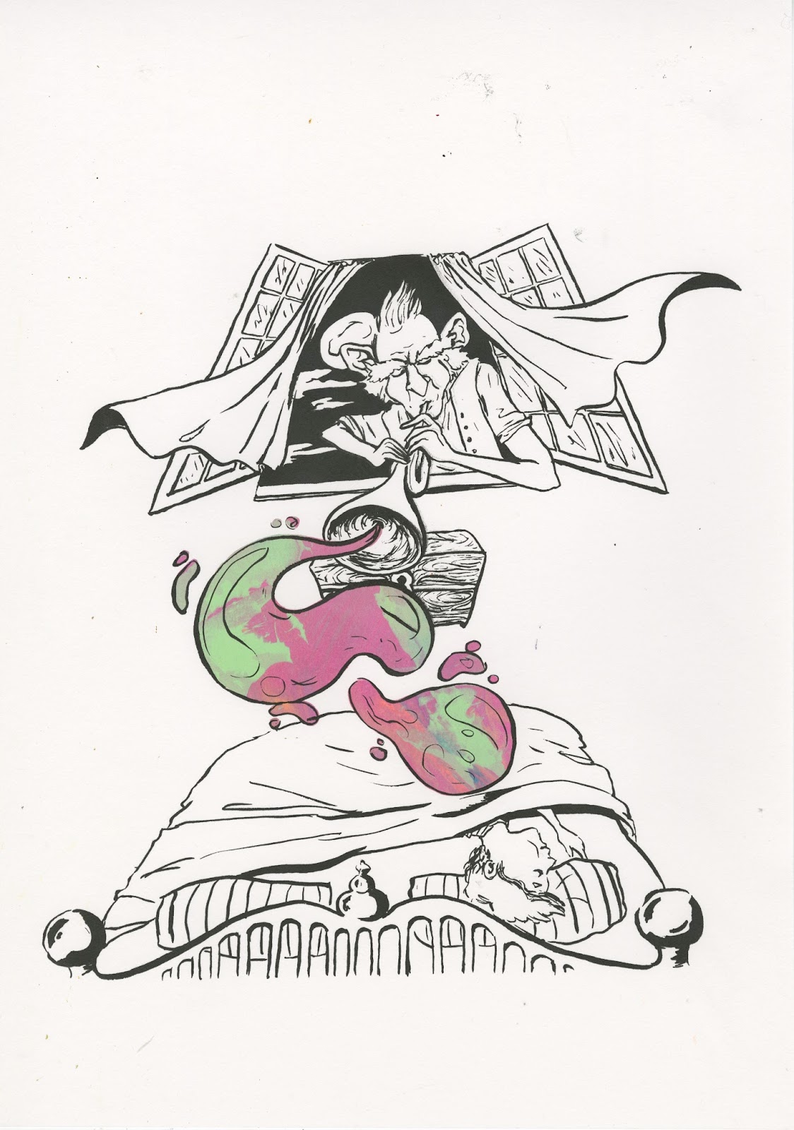
This was my favourite final print for the Bfg scene. It is my favourite because it has the most unique colour blend with the highest contrast of colours. The bright oranges and yellows work effectively with the darker purple and greens. I think the multicolours of the colour blend gives the impression of the dream being blown pretty effectively, I wanted to show the dream bubble with a swirl of variated colours. Screenwriting can give a very unique aesthetic that works well with what I was trying to achieve with the visual aesthetics of this print. As an image however I think it is still a little empty and could have been slightly more considered maybe with including the inside of the bedroom.

More prints of the Bfg, what I like about screenprintnig with the marble effect is that they all come out unique so you can choose the most effective, also the group gets to each have a print each.

My favourite part about this print is the yellow and orange highlights on the faces of the characters, it really gives the impression that the fire is a glowing source of light. I also think the added black helps to define the characters.


I tried to get a combination of peachy colours within this print. The orange pink and yellow tones make a convincing peach texture.

This collaboration brief I have to say that it has been interesting working on a group project as this is the first time i've ever had to do this. It has shown me how possible collaboration projects would be approached in the future and how a group can create an image rather than an individual. I was slightly disappointed that I couldn't do any of the design work for these images and only printed them and added colour but I have also learned that in group projects people have to make certain sacrifices in order to make a collected image.
No comments:
Post a Comment