Decks for change's aim is simple, "to change the world the best way we know how, by doing epic shit through design and skateboarding" Decks for change hold skate art competitions, exhibitions, workshops & auctions to raise money for skate parks and skate schools in developing countries.
Seeing as I have been designing skateboards in my own personal practice and have had quite a lot of recognition from skateboard designs, I thought this is a great opportunity to put my designs into a real competition brief.


The inspiring psychedelic artist Chris Dyer. Since I discovered his work I have constantly been inspired as I've followed his social media to keep updated with his latest projects. As I am going to be creating my skateboard design in the world of psychedelia, Chris Dyer is a perfect example not only because of his continuous work on skateboards but also his use of vibrant colours and sense of composition within the design. I also like the use of character throughout the skateboards but are also just made from various patterns. I will definitely use Chris Dyers style to fuel my own creation not only for the aesthetics of his art but also the underlying concepts and themes that run throughout his work.
Ive started to sketch down some ideas of how I could compose the skateboard design. For this competition brief the idea is to have a theme within the artwork that can have potential effect of spreading positivity. My artwork on this deck is to promote a positive awareness within the human consciousness. The main idea that I am trying to show is that through certain psychedelic experiences and spiritual practices, a heightened level of consciousness can be achieved which can create a positive impact on oneself and others around you. Meditative practices with the help of natural mind altering substances such as Dimethyltryptamine and Psilocybin that have been used for thousands of years can help the individual to gain new perspectives on life which can help people to deal with depression, anxiety, drug addiction and can also help people to accept death as a natural part of existence. I believe that these spiritual practices can really have a positive impact on the world and I am trying to communicate this into my artwork to help and inform as many people as I can who are unaware of these practices and substances.


As my deck is going to be designed within the realm of psychedelia I am going to approach it with the skills I have developed recently through my skateboard designing and also using the same media used to create the vibrant colours (acrylic paint pens)


As with the style and way in which I create the psychedelic images, I include a character and all kinds of objects such as a moon/sun, rubix cub, eyes, tentacles, space effects and planets, patterns, block colours and sacred geometry. I have all of these objects in my arsenal for designing it is just a case of considering them into a well formed composition and keeping a well balanced colour pallet.


Screenprint test


I have had a thought of possibly bringing some other elements of colour into my deck design. The marbled colour smudge process I learned in 504 is a perfect way for me to achieve this. So I have screen printed some tests of ways I could marble colour into the deck. I think this way of creating colour separations can get some really nice aesthetic textures (if the right combination of colour is applied). I also find this way of working to be really fun, splattering the different colours onto the screen and then hand printing them through is a very satisfying way to explore colour. I do intend on including this process somehow into my deck design, maybe with the collaboration of screen print and paint pens?

As far as tests go I think the colour smudge has been pretty successful, I haven't before used this amount of colour into a screen print but I think with my chosen theme of psychedelia it could work effectively. It creates a unique effect that can really be achieved in any other way and each print is completely different from all the others so I may have to print a number of colour smudges and select the most effective colours.
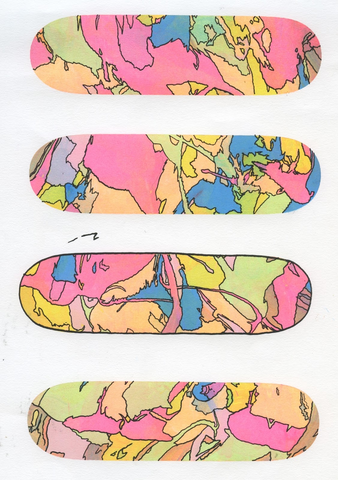
Ive tried separating the colour on some of these screen print designs with black pen. I think it really makes the colour pop out and forms a higher contrast. It creates what I call psychedelic camo. I could take this idea further into my final deck designs and apply pen on top of the printed colours. If not I think this aesthetic could potentially be effective on a range of products, potentially clothing.

More possible deck designs with the added use of marbled colour screen print.
For this specific brief, the requirements are only to produce one finished\finalised deck design, but because i have two completely different approaches to how I am going to design the desks I have decided to make both an acrylic painted skateboard with a complicated composition and also a screen printed deck that will be slightly more considered and reduced. Then I will choose the best of the designs and submit that for the competition.
This is the sketch of the composition I am going to be using for my final painted skateboard design. This will serve as a guide as to how I will compose and arrange the objects within the frame. I will not make the deck 100% on how this rough looks, I always make slight decisions and alterations as the skateboard is being painted but this rough will definitely help me with the overall composition. As for the colour pallet of this deck I don't really have a specific pallet before I start, I am aiming to just make it up as I go along but keeping colours consistent throughout it. I will be using a lot of pink, purple and blue as I think these colours can make a nice vibrant and harmonious combination that work well in the realm of psychedelic imagery.
This is the sketch of the composition I am going to be using for my final painted skateboard design. This will serve as a guide as to how I will compose and arrange the objects within the frame. I will not make the deck 100% on how this rough looks, I always make slight decisions and alterations as the skateboard is being painted but this rough will definitely help me with the overall composition. As for the colour pallet of this deck I don't really have a specific pallet before I start, I am aiming to just make it up as I go along but keeping colours consistent throughout it. I will be using a lot of pink, purple and blue as I think these colours can make a nice vibrant and harmonious combination that work well in the realm of psychedelic imagery.


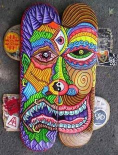
This is the final scanned version of my psychedelic painted skateboard design. This has been painted to exact dimensions of a full sized deck. My design is suppose to communicate some elements of the psychedelic experience, One of the main focus points of my design is the characters face and his third eye. This is a character I have been drawing and developing for some time now and he is suppose to represent a person undergoing a 'trip'. Opening the third eye (pineal gland) which is located in the centre of the forehead is known to be a part of a psychedelic or spiritual experience, It is said that through the activation of the third eye an individual is able to reach higher states of consciousness and connect to many different vibrations and frequencies that can change a persons perspective and can lead a more positive life. The space effect texture is also a significant part of this design because the space is being released from the characters third eye which suggests the infinite power of the trip. I also have added some sacred geometry and patterns into this composition as many geometric shapes and patterns are known to be visualised whilst influenced by these substances. I always aim to keep my designs as vibrant as possible when in the realm of psychedelia because vibrant and bright colours are always associated with the word 'trippy'. Overall I am pretty pleased with my design I have been wanting to create this kind of image for a while and it has been nice to just let loose and push the boundaries with colour and composition. But now after doing this deck design In this psychedelic style I have created I am now wanting to see if I can reduce and simplify this somehow and create a screen print that has the same same concept but a completely new simple aesthetic.


Screen printed skateboard design
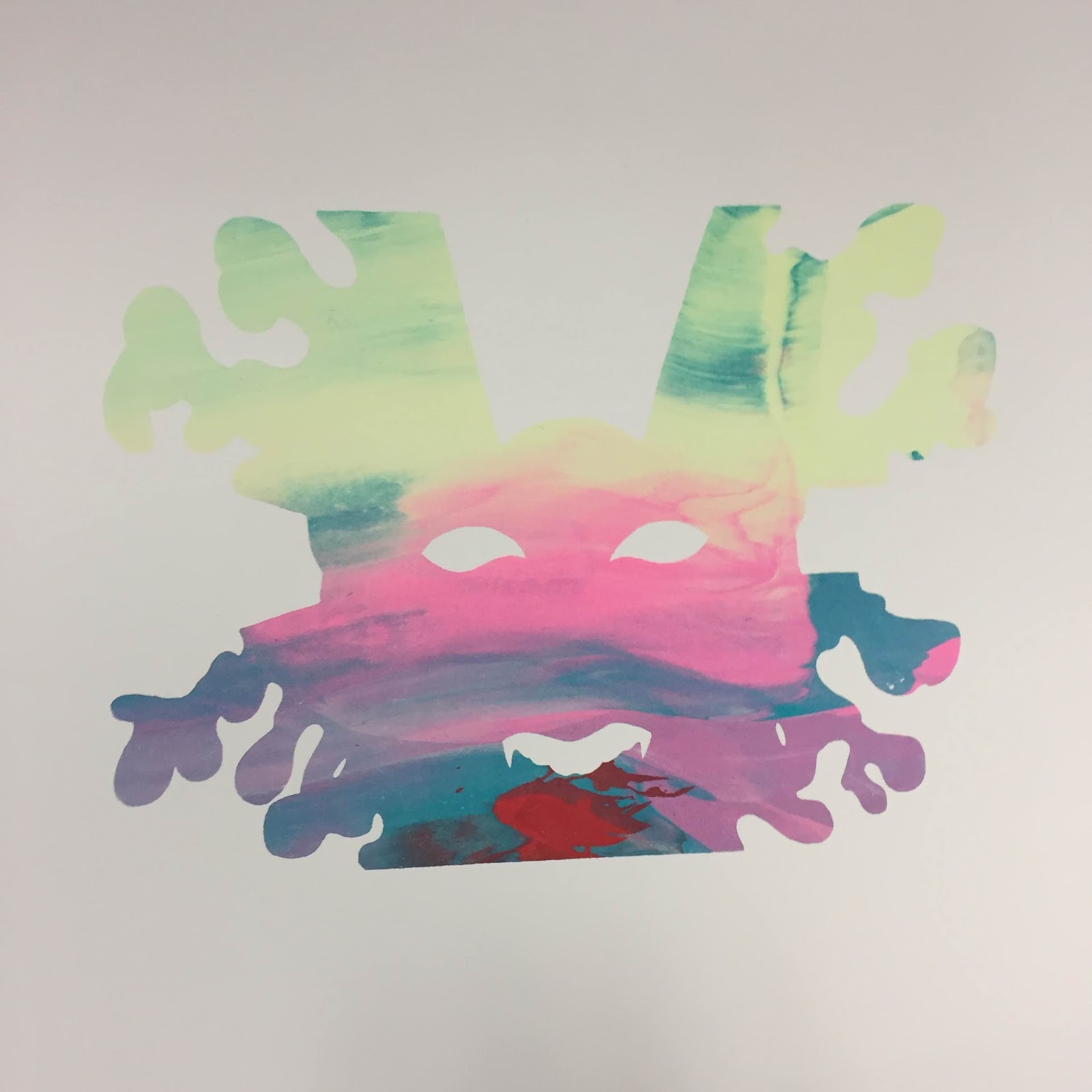
From the rough and sketching phase of designing the painted skateboard I had come up with a design that I knew I wanted to take forward into being screen printed. and this just focuses on the third eye character and the energy that is pulsing through his head and out of his pineal gland. I want to screen print this design so I can get more creative with the different possibilities of the colour blend effects.

This is the drawn version of the screen printed deck design I am going to print. This will be the black layer of the image that sits on top of the the multicolours that will separate the layers.


This is the positive of the shape of my characters face, It will be a full colour blend of specific colours. I intend on printing some variations of this so that when they are done they will all be unique and I will be able to select the most effective colour combinations. I only aim to use 2-3 colours within this shape because it may get too over crowded with colour if I'm not careful, also my other positive that represents energy will have a much wider colour pallet so I need to make sure there is a strong separation between the face and the energy.


The second layer has been printed so the energy and the face are in line for the third layer. This was my first time with a three layer screen print so I had to consider more registration with this. Out of eight prints only one of them was not accurate. I tried to make the colours more chaotic in the second layer to make more of a contrast between the colours of the face.


My final choice for the deck was my hand painted design, although I really like my new screen printed designs with the marbled effect but I think the overall vibrancy and full composition makes the painted skateboard a much more visually trippy and engaging design which will have a much better chance of catching someones eye. I was glad to see that just hours after I had sent them my design, they posted a cropped version of it onto there instagram page.

They also emailed me asking if my design could be shipped and I emailed them back saying It was defiantly a possibility for me to do this and then I never got a reply which is quite unfortunate because I thought my work could have been featured. Im still really happy with my designs and what I have learned in this process. Im sure there will be plenty more skateboard design competitions for me to enter in the future.
No comments:
Post a Comment