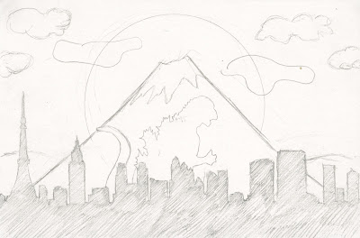
This is the final design that I have chosen to use for the Tokyo postcard. After the mini crit and asking classmates opinions, I decided to go with this design. It seemed to give the best communication of Tokyo and Godzilla. Although the image is not very simple, It still communicates the city well, by using the mounting in the back ground and the colours that I will use, it will be obvious that is is Tokyo.
This is the final design for the London postcard. I have chosen to use the iconic symbol of the topcoat to subtly communicate jack the riper into the postcard. If that doesn't make it clear then the blood drops coming from the hat makes it obvious that it is jack the ripper. This design is quite simple and will be made using a very dull colour pallet but using one accent colour for the blood.
For New York and King kong I have decided to make this one a little more humerous and playful. I thought this idea that the empire state building was the top of a banana was quite funny and it communicates the city and the monster quite well. I have drawn a little shape for king king at the top but I think i might reduce it down and just have the building and the banana. The character at the top may just over complicate it and the goal is to communicate with little information.
For the city of Massachusetts and the monstrous shark, I am keeping the same design from the workshop. Out of the roughs I reduced for jaws I think this was the most effective. The scale of the fin and the boat is clearly exaggerated but this is intentional. People know that jaws is a huge shark so by increasing the scale of the fin and having a small boat at the top, it gives a more obvious hint that it is in relation to jaws and therefore Massachusetts.


No comments:
Post a Comment