Tuesday 15 March 2016

End of module self evaluation


page1image632

Leeds College of Art
BA (Hons) ILLUSTRATION
Level
04
OUIL404 Visual Language
Credits
20
End of Module Self Evaluation

NAME
Kieran Jeffery


1.  Which practical skills and methodologies have you developed within this module and how effectively do you think you are employing them within your own practice?

Throughout this module I think that I have learned a wide range of skills and methodologies that will become useful tools in helping me progress as an illustrator. Through processes of observational drawing and line and mark making, I have developed and refined my drawing abilities and I consider the power of line quality when making any image. I have learned that line can be used in such an effective way and I now know that sometimes it can be more effective to reduce line down to a simple form to communicate a shape or idea. Another skill I have developed during this module is the ability to work with shape and texture. This is where I feel I have learned the most about how to make an image in a contemporary way. I have always been so used to drawing with basic pen and pencil media but this module has helped break out of that pattern and develop my knowledge and think about work more in terms of shape, texture and using new medias to create a more diverse range of outcomes. Composition is another practical skill I have developed during this module. I feel I am much more confident when composing an image within a scene and think this this is going to become a very useful tool when creating work for future projects and also my own personal practice.


2. Which principles/ theories of image making have you found most valuable during this module and how effectively do you think you are employing these within your own practice?

I have personally found each principle of image making to be valuable during this module. However, the most valuable principles for me are shape and texture. This is simply because I have never before considered these elements when making an image but I now understand that these theories of image making can be so effective, especially in the growing world of contemporary illustration. Considering shape and texture when making and image helps push me into experimenting and exploring with a wider range of media to create work in a more unique way. I have also leaned new process of making images such as screen-printing. I have found this to have huge value in my progression as an image maker. I really enjoyed the process of screen-printing and I think it has the potential to make my work look much more professional. The new principles and theories I have gained during this module has had a huge impact on the way I think about approaching my illustrations and I will employ this new knowledge into my own personal practice.

3. What strengths can you identify with your visual language submission and how can you capitalise on these

I think the strengths that I can identify with this submission is the way in which I think about making work. Before this module I was quite naïve in terms of what I considered to be illustration. Over the course of this module I now think that my eyes have been opened to more possibilities in terms of the media I will use and how to compose and image within a scene. My strongest part of illustration has always been my drawing ability and I think I have shown this during this module. Drawing has always been my primary form of communication through image and this is good but I have new ways in which I can communicate ideas that will defiantly filter into my own personal practice.

4. What areas for development can you identify within your Visual Language submission and how will you address these in the future?

There are always areas that can be developed within my own practice of illustration. I can always develop my drawing and crafting skills; I can always further develop my skills of using shape and texture. But for this module I think area that could use the most development is the willingness to explore the world of illustration and gain reference and principles from existing illustrators. This is my next step. I need to realise what kind of work is being made and how I can capitalise on these forms of illustration and integrate it into my own personal practice. This is how I will become a more realised illustrator by submerging myself into the creative world.

5. In what way has this module informed how you deconstruct and analyse artwork (whether your own or that of contemporary practitioners)?

From constantly making my own work and then seeing how peers have tackled the same task, this module has defiantly helped my skills when it comes to analysing artwork. When I now look at artwork I consider how the image has been made in terms of the media used, the composition and how effectively it communicates an idea. This is good for me because I now also know that my abilities of critically analysing pieces of illustration is becoming stronger and this will have a huge impact on how I create my own work and my peruse my personal practice of an image maker.


6.How would you grade yourself on the following areas:
(please indicate using an ‘x’) 

5= excellent, 4 = very good, 3 = good, 2 = average, 1 = poor

1
2
3
4
5
Attendance

x


Punctuality

x


Motivation


x


Commitment


x

Quantity of work produced


x


Quality of work produced


x

Contribution to the group


x


The evaluation of your work is an important part of the assessment criteria and represents a percentage of the overall grade. It is essential that you give yourself enough time to complete your written evaluation fully and with appropriate depth and level of self-reflection. If you have any questions relating to the self-evaluation process speak to a member of staff as soon as possible.


Monday 14 March 2016

Outfit/colour pallet task

For this task we were to take a photograph of ourselves wearing a selected colour pallet of clothing whilst considering composition. For this task I went out to a run down area of Leeds that had graffiti and tones that would compliment my specific colour pallet. I also just wanted to have the photograph taken in an urban environment.
This is the original photograph without the colour picker tones selected.
For this task I decided to chose an earthy tone colour pallet. I don't usually wear too many bright colours and I like my clothing to be subtle. I think these orange green tones work well together especially against the brick wall. I also decided to add an accent colour with the red bandana to spice up the outfit and provide a higher contrast between the deep and earthy colours.
Using the colour picker tool on Photoshop I have selected all the colours I chose to wear in the photograph and have been filled into the strips next to the image. This gives me a good view of the colour I have chosen and how they work as a set. I think I have chosen a nice colour set that has made an effective photograph.

Screen print/Fan art

For this task I have to design and create a piece of fan art. Fan art is basically drawing or somehow recreating an existing piece and making it in your own specific style. The piece of fan art must be screen printed using only two colours and the colour of the paper. Before this talk I had only screen printed once and I personally didn't like the process of screen printing, but this task may have the potential to change those views as the last time I screen printed it was a group task but now it is my own individual piece so I may enjoy it more. We also need to take the composition of the piece into account and create a poster with an effective composition.

Attack on Titan.
For my piece of fan art I have decided to choose one of my favourite anime shows of all time. Attack on titan is a Japanese style cartoon with a great story and has very unique characters. The first season of this anime has been released but the second is still on its way so my aim is to create a concept poster for the second season of Attack on titan. A very anticipated show that many people are eager to continue watching.

As this is only small task I have just sketched out some quick roughs of some possible compositions for the poster. I have chosen my two favourite characters from the show that I can include in the poster. Captain Levi and a Titan.
These are some drawings of the characters I am going to use in my fan art poster. Drawing them out in pencil first on separate sheets of paper will make it much easier for me to play around with some different compositions. I will also lightbox these drawings so they are much neater and will have crisper cleaner lines for a more professional looking poster. The line work and shadow areas will also be completely black shapes as there is no tone on screen prints unless there are halftones created on photoshop.
 This is the first design for my Attack on titan screen print fan art poster. As you can see I have filled all of the necessary black areas so it will create a nice block stencil when exposed. I quite like this design but I also think that it is very busy and when finished it could look very over crowded as a screen print. So halfway through drawing this I had a slight revelation to completely change the design and reduce it right down.
This is a positive for the character Levi for the screen print.
I have decided to completely take the the titan away from the poster and only use the character Captain Levi. I have done this because the steam around the titan became too much and the print would have looked too messy. However with this reduced design I think the poster will be a lot more effective and will also have much more breathing space on the page. I have changed Levi's position on the page so that he is directly in the centre. I have done this because there will be some red japanese type above him saying attack on titan .
These are some possible types styles that I could use above levi in the screen print. The sketchy type on the left may work nicely but for the sake of a screen print. But for the way I want the final outcome to look I think it will be best for the type to be how it is on the right page. This is how it is on attack on titan and it also looks more professional and will work better for the screen print.
This is the screen printed version of my fan art poster for Attack on titan. I am actually very pleased with the outcome and I think this piece looks quite professional. This task for me has been very useful, my views on screen printing have completely changed. I am now in love with the process and how it can make my work look. I love the textures that can be created and it is also nice that every print comes out differently and has its own unique quality. I will definitely be coming back to screen printing in future projects and I also have some plans to create my own personal work and get some screen prints done that could possibly be sold.
The task was to create a an A4 poster. I did this but with my favourite prints on the best paper I decided to reduce it down even more so there is less blank space around the page. I think trimming the page down has complimented the composition and has made it into a more effective poster. The red black and off white tone also creates a nice balance of colour and also makes it look more authentic and Japanese which was a persona aim of mine to achieve.

Visual language - Composition

This task is to design and create two A5 images including an object a figure and a landscape. When composing an image within a frame there are many factors that need to be taken into account that can make an effective and powerful image. Composition is one of the most important parts of any piece of artwork. Line of sight and lead in lines, depth, scale, value, over lapping and cropping all need to be considered when composing an image. For this task I need to make sure I have considered these crucial elements in order to create an effective composition. 

These are a few sketches and notes I have taken during the composition presentation to help me understand how some artists have approached simple but effective ways of composing an image.
 After this mini task was set I then started to rough out some possible composed scenes. When considering depth and line of sight it can immediately make a scene look more dynamic. Drawing is essentially creating an illusion on the page especially when it comes to the depth. I have tried to consider depth more than anything because I want to give the illusion that the scene I have created has layers and is not a flat image. Getting perspectives accurate also helps me to achieve this goal of depth.
 Out of all the roughs that were produced, the aim was to choose two of the best and draw them up larger. I quite liked this image that I composed, it is very different to how I would usually work and when I was roughing out the designs I looked over into the corner and saw a chair on its own and that is how I got the idea to do this. This image has an object is in a landscape and has a figure, which is the shadow produced by the chair which is quite weird and eerie but for some reason I like it. The perspective isnt completely accurate but sometimes that can add to the quality of an image.
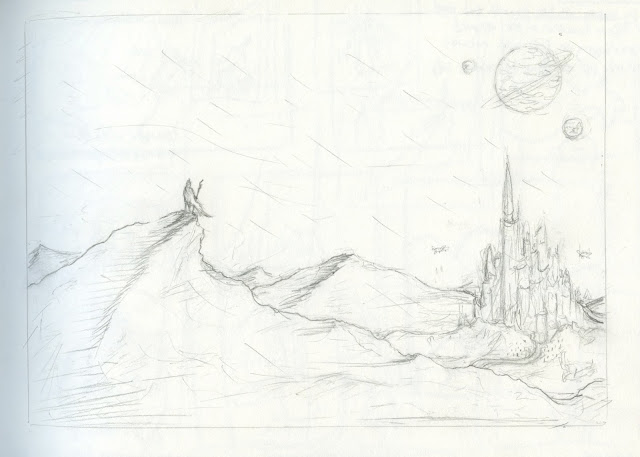
This image of composition is almost like a concept piece for a game. I chose to draw this one up as one of my finals because I like the sense of depth that has been created using the figure, mountains and the castle/citadel. It has been a while since I have created a scene purely from my imagination I have recently been using quite a lot of reference imagery to produce my illustrations and it has felt nice to just come up with a scene without reference. This task has help me think about how important it is to consider the different aspects that compose an image and this will defiantly become a useful tool for me as I progress as an image maker.
This was a short studio task where we had to compose and image that contained an elephant a butterfly and a figure. Again, with this image my main focus on the composition is the depth and scale. By drawing the figure in a certain position on the page and considering the depth I have been able to show that the person and the butterfly is much further back than the elephant which is right in the foreground. These tasks are really helping me to understand how important composition really is within any image. I now know that not all good composition are from images that are busy and crowded, sometimes the most simple composition can be the most effective.

3D Superhero task

 For this task we were to turn and mutate ourselves into a superhero using 3D shapes.
The aim was to echo our personalities into the superhero we have created for ourselves. This means that we should take the obvious aspects of our personality and exaggerate them into some for of a superhero.
Seeing as I do consider myself to be quite a spiritual person, I thought it would be good to echo this aspect of my personality and turn it into a superhero. This is shown through the third eye that has beed drawn onto the simple face. Once a persons third eye is open or is 'spiritually active', a persons life can be filled with much clarity and positive energy. I also didn't want to make it too serious so I designed the face that looks like a lazy sort of character, I meditate. save lives. and shit. It think this character I have made is a good representation of myself. Im spiritual, but not always too serious about it and I can sometimes get lazy so the words on his chest are all for a reason.
Just a few more photos of me wearing my uniform. I wanted one with the bedsheets cape. The camera quality isn't great which reduces the quality of the image but I don't think it matters too much because in the close up image, the text is readable. I have enjoyed this task, I have been quite serious with some tasks and haven't been playful enough. It has been nice to make something that is funny and makes people laugh. I will try and add some humour into my work throughout next projects when I feel like the seriousness is getting bit to much.

Wednesday 2 March 2016

I see faces - 3D gif

The gif is 3D because it has been made from cut out paper and the character has been raised off the background to get a 3D effect with the drop shadow. I decided to make this gif very simple with a low number of frames. One reason for this is because some things work better when they are simplified and reduced down and also after the dance and zombie gif I wanted to do something a little more light hearted and playful. 
The gif is made up of only three frames. I kept the background black for the first frame because his third eye is closed, but as the third eye opens, the colours of the universe are brought into the gif asif he is being awakened.
The third eye is opening and the colours are beginning to appear.
I wanted to show the use of the third eye and how it can open up possibilities to a whole new universe. I have just shown this in a playful way with the character and the background. This is the final scene and the third eye is fully open and the white dots have merged into the background. This gif will be reversed and on repeat so his eye will be forever opening and closing.
This is the three drawings used in the gif and this shows the movement of the characters arms and the eye opening. Using the light box has become one of my favourite tools during this gif project as it helps to get each drawing accurate and it speeds up the process of creating each frame.
The background in each frame is actually all the same piece of card. To speed things up I didn't make three separate backgrounds, I took each three photographs as the gif progressed. So I took a picture of the first character, worked into the background and then took the second, then repeated this process. It makes the dotted background more accurate and for a gif it is much easier to do it this way rather than making each background an individual frame.
Final 3D gif.

I am pleased with the outcome of this gif, I think the cut out paper works well. It elevates the character and brings him of the background and gives it life.

I see faces - Dance gif

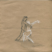
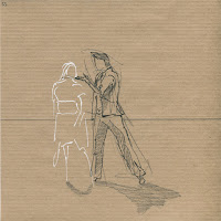
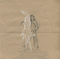
After being inspired by Ryan Woodwards beautiful gif. The first thing for me to do was to get some roughs and sketches down for the shapes of the male and female figure. This will help me when drawing up my gif because I have decided to not add too much detail to the characters and jut keep them reduced down to the shapes. This will help capture the movement over the entire gif instead of focusing on detail in each scene.

These are some sketchbook pages of the style in which I would like to produce the gif. Simple but proportionally accurate figures. I also like the idea of having sketchy lines around the figures. This may help to visualise the movement and add gesture to the figures and gif.

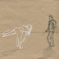
These are 6 out of 60 frames used in the gif. 
I decided to keep a similar colour pallet to the Ryan woodward dance gif. I feel like these colours create a nice balance on the page. The black, white and brown tone all work in sync. Ryan's dance gif is very smooth and is a slick animation whereas the dance gif I have produced is more glitchy and the lines are more random and chaotic. But I am glad that it turned out this way because the brown paper I decided to use is a very rough looking texture so the movement and the textures work well to create this mini dance scene.


 With this dance gif I wanted to test myself to see if I could make a short animation because I have always wanted to create some form of animation. I am very pleased with the outcome and I know I will be creating more gifs in future projects. It really brings the drawings to life. Editing and making adjustments to the frames has also helped me learn a few new tricks on photoshop which will come in good use. I am slowly becoming more realised with different tools and possibilities of photoshop that is just giving my work a slightly more polished look.

Final dance gif

Collage

For this studio task I had to create a composition using cut outs from newspapers and magazines. I decided to create a hiphop themed poster. I created this piece using cut out paper and then drawing back over the images using inc and paint pens. I really like this way of adding style to an image, by drawing back over the eyes with pen and outline the shapes.

All these cutouts of people are from random pages of magazines. The process of collage, cutting out and sticking can be quite a fun activity. I really enjoyed searching for the right shapes and then adding my own effects to the images using inc and pint pens. The inc is good for getting subtle textures and the paint pens are good for strong outlines and filling in certain features. I really like the process of cutting out shapes and arranging them in various compositions across the page. I will definitely consider working like this in future tasks.
This was a poster design that I created out of the uses of collage. I took the same concept from the previous piece and made an A4 poster design that includes some of my favourite hiphop artists. I used brusho inc for the splatter and drip effect in the background but I think this may have over complicated the image and there maybe too much going off. Other than that I do like the idea of drawing back over people and adding textures, it can make some very interesting marks and visuals for a poster, especially the white eyes on a dark figure.

Tuesday 1 March 2016

I see faces - Dance gif inspiration

I was rolling down my Instagram feed and I came across a mini animation posted by the Instagram page 'Worldofartists'. I was instantly inspired by Ryan Woodwards animation called thought of you. The animation is a short love story and the male and female characters are drawn in a very simple way but the fluidity of the movements makes it a very lovely and elegant gif. My work in the past has been quite dark and has got a sinister approach. The zombie face gif is almost scary to look at and I now want to make a piece of work that is slightly more heartwarming.

I really like the colours that have been used to create this animation. The black male figure with the white female figure and the pale brown background work perfectly in harmony with each other.
There has been a balance created across the animation by using these soft and subtle colours. I may use a similar colour pallet when making my gif, but as it will be drawn by hand it will look much more rough and framey compared to this which is very fluid and smooth.
 There is a lot of energy in this gif/animation and it is shown through the movement of the characters. Every time I watch it, it makes me feel good. I want to create something that has the same impact on others when they watch it and something like this is a good way for me to do so. I have never really done anything like this before so it will be good to change my style for one of the gifs instead of having high detailed drawings.
https://www.instagram.com/p/BBxPvhwlQTB/?taken-by=worldofartists
link to the Instagram gif.

These are some sketches by Ryan Woodward. The way he captures the human form is beautiful. They are very gestural and confident, creating this sketchy shape of lines that is the human form. The lines he uses almost captures the movement of characters and exaggerated it. I may include these kind of lines in my gif to get the feel of flow and movement.


After seeing the mini animation by Ryan Woodward I then started to look at some pair contemporary dances to help inspire the movement and action that will take place during the gif I am going to make. I am pleased to say that I really enjoyed looking at theses videos. They can be quite mesmerising and its nice to see such strong trust and connection between two people. It is what I want to show in my gif. The connection people can have, but is shown through movement of dance.
After searching many videos of contemporary dance for the right moment, Ive finally found the one I am going to use for my gif. The video itself is 3 minuets long but I have found a 4-5 second scene within the dance that I am going to animate into a gif. I think the moment I have chosen to animate has really captured the feeling I am trying to get across with this gif.
The dance itself is actually really beautiful and I would like to animate more of it but for the sake of a gif, 4-5 seconds will be long enough to capture some form and gestural movements between two partners during a dance.

Mayo Alanen & Colby Massanari - Young & Beautiful by Lana Del Rey - Contemporary Ballroom Showdance