Thursday 17 May 2018

End of module evaluation


At the start of this module I had a good idea on how I was going to approach a wide range of different image making methods in order to build up and strengthen my drawing, painting and printing abilities. My initial goal was to create my own self directed briefs that would test the limits of my skills and also to help me build and develop a strong portfolio of work that clearly speaks for the themes and subjects I am trying to communicate.  I think I have achieved that goal as extended practice has been a very diverse module which has overall been very beneficial for the development of my work and Ideas and has been part of creating some of my most successful pieces of artwork to date.
One of the most successful parts about this module is that it has enabled me to show much development of work across a wide range of processes. Screen printing onto clothing was a big part of one of my briefs 'Weirdo' that helped me to refine an idea into starting a potential clothing brand. After the 505 module last year I have been wanting to create my own range or hand printed garments and 603 has really allowed me to develop and explore this. By working with a graffiti artist I have taken a much different approach to my usual style of image making but this worked very well with the name of the brand. Printing onto clothes has been a very enjoyable experience and it has helped me to gain more popularity through the constant use of my Instagram page. I will surly be focusing on this when I graduate and start making the transition from a student to a professional.

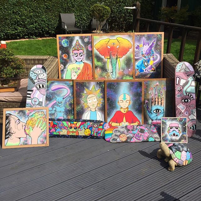
My painting skills have also developed at a fast rate over the course of this module due to the commissions I have been given and the different self motivated painted briefs that I tackled. This is very important to me as painting is the core of my current practice so I must be consistently painting in my psychedelic style in order to refine my abilities. The painted house brief was a very good place for me to bring together what I have recently been developing and to see it in a professional context. That brief enabled me to scale up my work and bring in new forms of media such as spray paint to gain new techniques and methods that will be utilised further in the future.

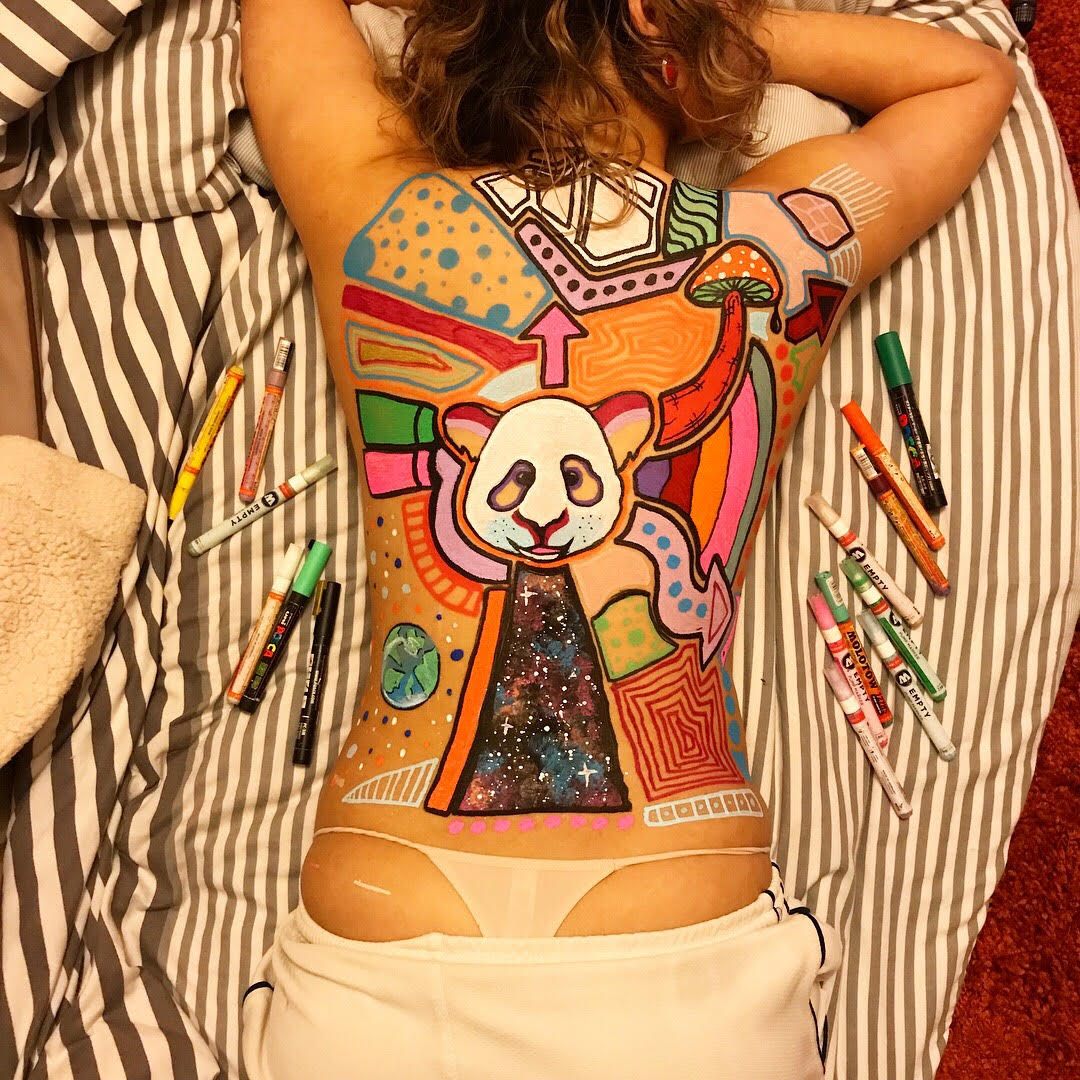
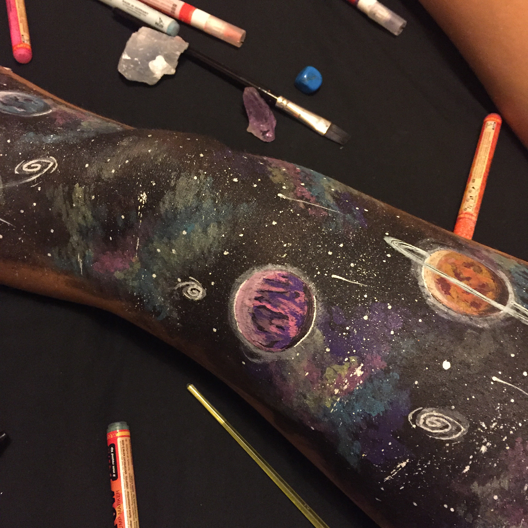
Painting on people and different surfaces was also a big step for my creative practice to evolve. This was the most interesting of the self directed briefs as it allowed me to see how my work can effectively be applied to a range of objects. The body art section of this project was especially interesting and engaging, meeting new people and having an interaction along side the painting made it a series of memorable experiences which I will continue to explore. I have also been looking into festivals as this could be a promising setting for my psychedelic body painting. Overall, The painting section of this module has taught me a great deal about my skills, how to apply them, where they sit in the real world and what steps I need to be taking to get a professional career from my practice.

While I have gained  many new skills and have a lot of positive things to say about this module as a whole, I do have some ways in which I could of gotten the most out of my time and in doing things slightly different I could of achieved more informed artwork.
I feel that I could of seen much more of a sketchbook throughout this module which would of helped me in many ways to rough out ideas and develop them slowly instead of keeping most of my ideas in my head. Another way I could of improved this module is by doing more contextual research into various subjects and artists that could of potentially helped to inform my outcomes. Finally I haven't been completely organised with the structuring of my briefs and this has had an impact on the overall quality. Time management is something that I usually struggle with especially when it comes to writing or having to formally present my work. This is something that I am continuing to work on and will hopefully gain better time management and organisation skills when I enter the professional world.
Overall taking all things into consideration I am still very pleased with the work I have made in this module and I now how new ideas about how to improve my creative abilities being both working on my strengths and weaknesses to become a higher level artist and image maker.

Design boards

Collaborations

Over this year I have done a few collaborated paintings. These have always been random and just for the sake of painting but I think it has created some interesting outcomes.


This is a combination of mine and Wilf's paintings done on a legal graffiti spot in Leeds. For this, the only media used was spray paints which is a first for me because I always use the combination of pens and spray paint. This did prove to be quite difficult as it is a much different hand style that I am still learning. These Collaborated spray paintings are a very good way for mw to scale up my work and apply colour and line work more immediately and fluidly. I will be developing this as much as possible in my personal practice.


This is another collaboration between me and Wilf, only this one is much smaller and is much more complex. We didn't really have any objective and is more of a joint doodle of our different styles combined into one. Paint pens, felt tips and crayons were all used in making this. The mixed media approach is what makes this an interesting image. After doing this we now have many new ideas about how we can scale this up into making a mural sized painting between us in the same style of randomness and coloufull with faces, characters, mushrooms, geometry, space effects and simple patterns. This is something we will be further developing.


This is the final collaboration piece I worked on this year. Between me, wilf and two other students we created this highly vibrant abstract painting. Spray paint, paint pens and acrylic paint were all used in the making of this piece. I really enjoyed making this as it was a group effort of experimentation. Just applying colour in different places between us and building up layers to create different effects was interesting. I never work in that way and am usually much more considerate where I apply colour and how to do it so this was a good way for me to let go of my usual way of working and dont focus on detail but just to think more about colour application and texture. I actually really like the outcome, it had no original objective and just became what it is naturally from our combined painting. If i've learned anything from collaborations in this way it is that loosening up and just being more playful and abstract can really get new and interesting outcomes. I will trying to explore this way of painting as much as I can in the future.

Portraits


I was asked by a few friends to do a portrait of them in my colourful/psychedelic style. This is a very straight forward brief and I am just refining this style of using paint pens. This has been quite beneficial because it has given me a few different ideas about how I can further develop this into something potentially more prosperous.
I have had a few ideas of doing famous people or different fictional characters in this psychedelic zombie style and this could help me to get my work more recognised, especially on social media. My style is beginning to become much more consistent which I think is proving to be a good way for my practice to become more professional.


My friend who is a DJ wanted his face with headphones to use as his logo and also as a design to be printed onto tshirts. I do however think that this design doesnt work very effectively. I wasn't considering the colours as effectively on this and have used too many. These trippy portraits work better with limited colour with a mix or dark and light tones. In this I have done too many light tones that doent create a balance. This is a good discovery though because in my next portrait I will keep it much more reduced and balanced.


I am much happier with this portrait design. Keeping a limited and more considered palette using both dark and light tones of complimentary colours proves to be much more effective. I will be doing much more of these trippy zombie portraits and I will keep in mind what I have discovered and I will be able to make much more effective images. 


Secret 7 brief - Jimi Hendrix

After undergoing my own self directed briefs and exploring and developing ways in which my practice can be applied, I thought now was a good time to get involved in a competition brief. 
I chose to do Jimi Hendrix for the cover design as I love his music and as I will be doing a portrait image I wanted someone who has an interesting face.
I will be aiming to make a psychedelic version of Hendrix which is perfect as his music played a big role in the psychedelic revolution in the 60's and 70's.


With most of the briefs I have explored for this module I haven't needed to spend any time sketching ideas down and they have consisted mainly of final pieces and exploration through the process of painting rather that speculating ideas through roughing. I feel that with much of my recent practice I havent needed to spend much time fleshing out ideas and compositions. I have been much more immediate with how I have worked but for this competition brief I thought it was necessary to go back to the sketches so I could figure out some different ways in which I could design this cover. I haven't spent too long on the sketching part because at my current level I dont think it is too necessary but getting some ideas down deffinatley proved useful so I can explore a range of compositions.


This is the portrait of Hendrix that I have decided to use for the psychedelic album cover. This is because it is a good clear photo of his face which is vital 


After fleshing out a range of ideas I decided to refine the most simple of the sketches. I initially intended on having a very complex psychedelic background design with different colours, patterns and shapes but I decided to keep it a little bit more simple because having a very complex background might have been too much and uneasy on the eyes. I also wanted there to be more focus on Jimi Hendrix so just having my usual space background makes him much more visible. I wanted to create this cover that also echos my own art style as much as possible so using the media of paint pens I have kept authentic to my style. I decided to use only three colours in Hendrix face because in the past I have discovered that putting too many colours in portraits can make the overall aesthetic to busy so having a reduced palette has been much more sucessful.
Overall I think this does work quite well as a hendrix portrait but maybe not so much as an album cover and it is definately not the best piece I have done and I have stayed within my usual boundaries which has made it slightly limiting. If I was to go back and change anything I would have made this design a screenprint rather than a painting as a colour blended texture would have made a much more professional outcome.

Commissions and paintings

This is another self motivated brief I have set up for myself. The original goal for this brief was to simply design and create as many paintings as possible, focusing on a wide range of different characters and themes. This brief both consists of my own personal artwork that has been sold and also requested commissions from people around the world. This has allowed me to really explore my own skills and refine my psychedelic painting style, as well as figure out new processes in how I can create a piece of art. This brief has been a big step for me and has taken me out of a sketchbook where I no longer feel comfortable and has allowed me to gain new knowledge through the simple process of doing. Instead of spending hours sketching ideas, I now think it is much more beneficial for me to get a few ideas in my head and start painting on a larger scale. This is where I am most effectively able to develop my practice.


Working in this way allows me to have an idea of a painting and simply make that idea into a reality without having to think about it too much. The main thing that is considered with working in this way is the colour palette that is going to be used. By working in this way it is helping me to create more refined colour schemes.


Fictional characters
Fictional characters have been a big part of my commission work recently and this is a good way for me to further progress with my drawing skills. These mostly consist of cartoon characters such as Dragon ball z, Adventure time and Avatar which is perfect for me as they are made up of bold flat colours which is my preferred way of painting. 


Most of these commissions have been painted onto wood. This hasnt been necessary but I decided to do this because I think it makes the painting look more professional. Combining the bright colours of the character and space effect with the natural textures of the wood creates a nice balance across the piece. Just by giving the paintings a wooden boarder it really enhances the contrast of the colours to make them seem more vivid. 
I also dyed the wooden boarders with various wood dyes and stains. This is a method I developed last year and since then I have been using it to help elevate the overall quality of my paintings.


Requested paintings 

This brain licking girl was a requested painting and once it was posted online, I immediately had a second request for it it be painted again.
I really liked doing this psychedelic erotic painting as it is not something I would initially choose to do myself but it proved to be pretty successful. Using a combination of paint pens and spray paint like my other commissions I am really getting a more consistent aesthetic within my practice but am also exploring new possibilities within the media. 
I really like the concept of this painting and it is suppose to be a metaphor of someone tasting anther persons mind or thoughts on an intimate level. Much of my work doesn't have much conceptual context behind it but with this brain licker does which makes me want to bring some more subtle concepts or metaphors within my paintings and imagery.


Water colour dog portrait commission

This commission was especially challenging for me because I was asked to do it using watercolour which is a media I never use and is an aesthetic that I am usually not interested in pursuing but I was very surprised with the outcome of this.
I don't believe this is one of my best pieces and as an overall image I don't think it is quite as professional as others and has a very feminine aesthetic. But I do think that I have surprised myself with the application of media. It was a nice change to try something new with a completely different approach. Using the watercolours to my advantage and loosening up my hand to create more splashy and drippy effects was a nice change to focusing on line work and detail. This portrait has hardly any lines and is just made up of blending colour tones. Again this is a way in working that is very unfamiliar to me but was a good experience for me to develop.
My final thoughts are that I could take this use of media further but combine it with my detail and bold block colours to create a multi media finalised and refined style of illustration.


Psychedelic owl commission

This is another commission that has made me take an alternative approach. The background and wood texture was nothing new but the way in which the owl has been painted is a new method. Just using paint brushes with acrylic paint and building up the colours layer by layer to get the desired effect of the feathers. At first this was a challenge for me and it took a while for the image to start coming to life but patience was key with this painting and working on the layers was a difficult task but i'm happy with the end result.
Again this painting has pushed me out of my comfort zone and pushed me to try something new to create a new aesthetic instead of being stuck in my usual ways, This is why being given specific commissions enables me to try new things and further develop my knowledge and skills.


Japanese dragon commission 

This commission is one of my favourite pieces I have done this year, this is because it is quite different to anything else I have previously painted. This was one of the most challenging designs which took much time and consideration. 
I decided to use a much more muted colour palette for this using a small range of pastel tones rather than my usual psychedelic vibrant colours. This was a good choice and it helps to create a more authentic traditional aesthetic.
Most of this dragon painting was done with using paintbrushes, only the line work was done in black pens but slightly changing the media to paintbrushes and acrylic was more difficult and I had to take a new approach. Getting the feel with paintbrushes is helpful for me which can push me away from constantly using pens and allows me to mix colours and make up my own tones and shades. In doing this I am further helping my knowledge of colour expand.
I also think it is nice to see one of my images created without having to use a space effect to fill out the background. I can get very caught in using that to fall back on as it comes to me now as second nature. But this has shown me that I dont always need to do that and it can actually look more professional and refined without it.


Religious figures

Through Instagram I was given a few commissions of the spiritual/religious figures Buddha and Ganesh. For this I was instructed to paint them both with a psychedelic twist which would involve my space background with planets and also a magic mushroom. These are some of my most successful paintings within this brief that reach the peak of my current skill level.
Using my most comfortable and consistent media tools (paint pens and spray paint) I am able to have much more control of the outcome.
The Ganesh painting however was the first time that I had created my own stencils of different sections to create the colour effects using spray paints. This was the first time in doing this but it proved to be successful. Because this painting is so large i couldn't just use pens for the colour so I had to develop a new process. Working larger scale really helps to develop new ideas especially with the use of media.


I used spray paint for the background textures on the Ganesh and a paintbrush for the background on the Buddha. It is quite clear to see the distinction between the two but I think the Buddha had a more successful outcome, this is because I left much more black and is not overly saturated with colour which provides alot more depth in the image. By testing new ways of working I am able to figure out the best processes which will lead to the most professional looking outcomes.


To make these two religious paintings more playful and modern I added the round glasses which takes away the seriousness of the religious connotations and makes it more acceptable to include psychedelic features. 


Skateboards


Pawzeus

last year I designed and invented a psychedelic cartoon character who is based around the shape of a cat and I named him Pawzeus. Putting him onto a skateboard wasnt a commission but has been something that I wanted to do ever since he was created. This is one of my favourite skateboard designs because of the colour choice, using a wide range of pastels and neon colours also with the strips on wood texture that increase the overall brightness of the design. 
Pawzeus is a character that I will continue to develop and paint onto as many objects and surfaces as possible. I was even thinking of turning him into a short animation sometime in the future.


Space bedroom painting 

Large scale space effect made using only spray paints.


Reflective review 

This self directed brief has overall been a very positive project in terms of the development of my painting and practical skills. Aesthetically this is where my strongest images are presented, I have used this brief to refine my practice as much as possible in consideration of colour, composition and detail of my painted pictures. I have enjoyed painting each of these images and it has been informative to my practice as well as getting my work more noticed so I am constantly being asked for commissions. One of the main things that I have learned in this project is the use of different medias, Paint pens, spray paint, water colour, acrylic paint and marble inks have all be explored within this project to get a wide range of psychedelic and colourful aesthetics. I have spent the most time on the craftsmanship of these pieces because commissioned work needs to be professional and well crafted. I have used a lot of space textures and planets into my paintings which has been a good way for me to refine this but I have also discovered that it is necessary to not include that and to not always rely on the space effect to make up most of my image and designs. 
If I could change some elements of this brief it would be to have a sketchbook where I can keep all of my ideas for possible painting designs. While I have learned much from doing and painting I think I should of kept some sketches to help me visualise a few of the commissions, this could of helped with the whole processes and methods of the making of my art and being more considerate towards the compositions. Another way in which I could have made this project better is having done some research into context for my commissions and paintings. This would have made my work more informed which could have lead to a more refined and solid outcome. 
Painting is what I love doing and will be the heart of my practice and career as an image maker and I am still learning many new things and I have much to learn. This project has helped me to figure out ways in which I can improve my practice so that when I graduate I am much more equipped with the skills, knowledge and mindset that will allow me to reach my full potential as an artist.


Painting people and surfaces

I have decided to create my own brief in the pursuit of painting onto as many different surfaces and objects as possible. While I love screen printing, this is where I find the most enjoyment in my practice and bringing colour and vibrancy to things is a good way for me to explore new ways in which i can apply my skills to real life. Pieces of wood, sculptures, masks, guitars, drum skins, skateboards and more. The possibilities are endless with this self driven brief and the objective is to explore and develop this as much as I can to figure out different ways in which I can add colour, shapes and patterns to colourless objects. I would also like to paint onto a range of organic objects such as parts of a tree or even people(body painting). Im trying to think outside the box and want to be out of my sketchbook in this brief. The goal is to have a range of finished designs.


The turtle above is made out of stone so it is interesting to see that my work can even be applied onto a rough texture although the design needs to be much more simple as it is hard to get more intricate line work onto a bumpy and uneven surface. I am gaining much more knowledge from this self motivate brief about different ways in which my work can be applied and developed.


The more objects I paint on the more ideas I am beginning to formulate. Working sometimes with bright vibrant colours and space textures and also minimalising the colour scheme im beginning see different ways in which I can apply aesthetics to different potential products. 
By painting onto guitars and objects instead of being stuck in my sketchbook, it is helping my artwork to become more widely recognised and I believe it is more of what people want to see from my practice.


Paint pens such as Posca and Molotow are the most important tools that enable me to paint on a wide range of surfaces. Without them it would be very difficult to achieve bold, vibrant and consistent colours onto the varied objects and surfaces. These pens are by far my favourite media and they help me to keep my style consistent and psychedelic. 


Tribal zebra mask


This is much different to my usual painting style and I have taken a much more tribal approach. Most carved wooden masks usually dont involve much colour and are often just left with the wooden textures or just painted black and white, I have decided to keep the same form of the zebra stripes with this and keep it simple shapes with a more reduced colour palette.
I could have chosen to do a much more intricate design but I have chosen to keep it simple as I was trying to keep the tribal aesthetic more  authentic.
I started with spray painting this black and dark purple for the under layer so that the paint pens would have a much more vibrant and colourful contrast making it a psychedelic tribal zebra.


Painting People

Painting people is pretty much the second part of this self motivated brief. While I have painted on a wide range of surfaces, I have also set out to paint on different bodies in the form of body art. This is something I have never attempted in the past so I didnt really have to much of a plan with this and was just willing to let it unfold naturally. After I had painted my fist human body and displayed this on social media(Instagram) many more people were willing to let me put my artwork onto their skin.

This is the most unique brief that I have set myself because it has allowed me to push the boundaries with my practice and meet different people through my artwork. It has also been one of the most enjoyable briefs becuse painting onto a human body is very challenging but it is very nice to have human interaction which I think is essential for the development and exploration of my practice. 


I have learned much about painting bodies in my specific style and it seems that like with any different surface, my hand style needs to slightly adapt and for bodies(skin) I had to reduce the level of detail and just focus more on block colour, shapes with a few bits of detail. People move, skin is stretchy or uneven, the body is an irregular shape that has contours and non of this can be predicted as each body is different and unique so it required alot of confidence not only to meet new people but also to be bold with my decision on where to put colour and simply just play around with a willingness to make a few mistakes.
These mistakes are sometimes what make it more unique.


Bringing a fictional character onto painted people I think is a good idea especially when it comes to displaying it on social media because people instantly make a connection with the knowable character which can immediately make my body paintings more noticed. Also using my own features such as mushrooms has helped make these body paintings more authentic to my consistent and developing psychedelic style. 


This is one of my favourite designs of painted people because I have left much more skin tone which works very well with the bright and bold colours. This is a more reduced and simple design but again I am discovering that the simple designs prove to be more effective. 


This design is the most complex of all the painted people that took the longest to paint but in fact this one proved to be the most unsuccessful. I tried to fill in to much information with too much colour but the end result ended up being abit to messy. I put the most effort into this but it turns out that it was simply too much. I have definately leaned from this experience and I am beginning  to realise more and more that by reducing the complexity can often be much more successful. I will be taking this idea further into my practice especially with body art.


Reflective review

Overall I would say that this has been the most interesting brief that I have developed during this module. It has been both fun and challenging. Firstly, I have really enjoyed this brief because it has allowed me to really allowed me to think outside my usual ways of working and by applying my work onto different surfaces I am beginning to get a better sense of what my artwork is and where it could exist in a more professional context. This brief was especially enjoyable as I have been able to meet new people and convert my skills onto a human body which before this module I never even considered so it gave me the confidence and motivation to explore different aspects of my practice. Because it is not as easy to paint onto different surfaces and textures this brief has pushed me into reducing specific elements of my designs down to a more minimal approach which is something that I usually dont like doing and really struggle with but now in retrospect I see that it is helping me refine. So in this module I have actually discovered a lot about my work, how to improve it and has helped my confidence both in both painting and socially.
This project has been also very challenging and what I didn't like about it was it made me stuck in using the same media over and over again (paint pens). While this is easily my favourite and strongest use of materials, I do get bored of using the same colours and pens after a while and this can make some of my tasks tedious and it can be hard for me to develop new ways in which I can change and expand on my existing knowledge. If I could change any part of how I have approached this module it would be to have a sketchbook along side the different paintings. While it is fun and experimental to just go with my instinct and paint what ever feels natural at the time, I think I could have come up with a few more interesting designs and compositions especially on the painted people. I thought that it wasn't necessary to sketch and rough ideas down but thinking back to it I know it would of helped me to achieve more well informed and refined outcomes.
I will surly be carrying on this form of my practice further into the professional world as I get a lot of enjoyment out of painting onto a wide range of objects and surfaces, I will however be much more aware that I can spend some time sketching and fleshing out ideas before I start painting, I will also be considering using a more diverse range of tools to get different aesthetics instead of just using paint pens. This will hopefully increase the overall quality and professionalism of my practice.