After drawing thumbnails and getting a good idea for how each of my favourite designs on the different formats will look, the next step is to scale it up and refine the image. In doing this Im getting a better visualisation of the finished image and then I can start narrowing down my designs to a final image and also depict each image to see how they could possibly be improved wether that be adding more detail or reducing down, changing the colours slightly, maybe add a new texture. This stage of the image is where a little more experimentation can be done before the final design is made.
This a rough version of how I want my square image to look. As Carl Sagan is a space enthusiast I want to include astronauts into my editorials. This is my favourite of the square designs but the finalised version of this will be much more detailed and the background will be textured with the space background. I have found doing this beneficial because I now have a better visual on how my final image will look so I know where the improvements can be made.
I like the idea of including sacred geometry into the editorials as it communicates a concept that Carl Sagan states(sacred geometry is the printed form of which the universe is built up of.) Although I still do prefer the astronaut idea and I think it works better aesthetically rather than communication. I think I will include this geometric symbol in one of the different formats.
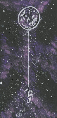
These were my two favourite designs for the portrait format. I really like the concept in the moon balloon because it communicates our attachment to space in a simple way and links to Carl Sagans idea that we are all made of star stuff. But I think I will be choosing the astronaut for this design because I think it has a stronger composition and is visually better, especially with the detailed background. I may reduce the design down to maybe one planet or even put some geometry in the background.
This rough version of the space background with the silhouettes is how I a going to create my final landscape editorial image. I want to have a more simple design for this and the other two more detailed. The idea for this is a nights sky from another planet and how the cosmos would look from the perspective of alien life. But before I make my final image I must first do some colour tests to see what will work best.
As I have decided that I will be using a space/cosmic texture in the background for my editorials, I thought that testings a range of colours would help me to visualise a better outcome. I have only ever used purple and pink to create these backgrounds so it has been very helpful to see these similar textures with different colours. I have also asked a range of people which colour they prefer and most said either green or yellow. I agree with these opinions because I think the higher contrast colours make a stronger background texture. I will be using what i have learned here in my final editorials.


No comments:
Post a Comment