Friday 21 October 2016

Studio Brief 1 Final Outcomes

mask has been removed like other format
talk about the digital elements
should have done it on white paper then inverted(more detail)
why i chose the geometry
this was my favourite outcome 
remove masks
yellow contrast
maybe to busy could be reduced 
scaled down astronauts 

kept the astronaut theme
purple colour nice but could have used yellow better as a set
was going to use cut paper but combined the images digitally 

Thursday 20 October 2016

Studio Brief 1 - Photoshop discovery

I originally had this cosmic sky with the silhouette as my final landscape editorial design. After completing this image I was not satisfied at all, It didnt take me long and I already knew what the final outcome would look like before I had started. I felt like I wasn't pushing myself to create something totally new so I decided to go back and redesign the whole landscape image.
As my other two formats for this brief both included astronauts, I thought the best thing to do was include astronauts across each of them so they work together as a set. I then went back to my sketches and refined my astronaut drawings and arranged them onto the landscape format. My original intention was to just have a simple black and white image of the astronauts but again I always create work using black on white so this was nothing new to me, I hadn't discovered anything and also this image of astronauts does not have an editorial aesthetic, it needs to be changed.

The two cosmos space textures above are actually the same image but the the brighter one has been scanned into photoshop and slightly edited, adjusting the levels and enhancing the brightness and contrast which are simple tricks that can really increase the overall quality of the image. My original plan was to craft all of my editorial designs using only analogue media but I have now realised that combining both digital with analogue can really enhance the quality to make a more professional and refined outcome. 
After discussing the astronaut drawing with classmates and rethinking it myself, I have tried to combine the drawing with the space background. This has been done by inverting the original drawing into white and cropping out all of the unnecassary, then layering that on top of the space texture. I am so glad that I did this as a last minuet decision because I think the outcome looks a lot better than the drawn version and I have also learned some new digital skills that I'm sure will only progress now i am eager to use more digital tools to improve my practice.
I was looking at the astronaut image and I thought that the white helmets looked to blocky and full so I rubbed out the white and let the space texture show through but inverting the glare into white highlights. I think after doing this, the image becomes a lot easier to look at and the astronauts seem to become more part of the whole image rather than just being a separate layer on the top. I now realise that these slight digital adjustments can make such a big difference to the aesthetics of an      image.                                                                               
1.
2.
3.

After I had completely changed the way the landscape design looked, I wanted to do the same to the portrait as it would look better as a set and also the digital tools would allow me to create a more refined outcome.

3. was my first final design. It has been made from white pen on black paper, then cut out and stuck onto the cosmic background. While I was quite happy with the outcome I thought that the digital tools would definitely help me to enhance the image.
2. Is the same image but with the levels, brightness and contrast adjusted to bring out the light tones and darken the dark. This contrast make the image more vibrant. I have also got the image without the planet in the background, I Think the planet removed looks slightly better and reduced, plus its a little cliche to just have a planet with the astronaut, I wanted to bring more aspects of Carl Sagan into the design.
1. now has a piece of sacred geometry in the background. I have done this in the same way as the four astronauts, I drew the geometric shape in pencil and then inverted that to white and layered it onto the space background. I think that this works better than the planet because it is more of a subtle shape and the geometry relates more to Carl Sagan so for the editorial its more appropriate.

Studio Brief 1 Refining


After drawing thumbnails and getting a good idea for how each of my favourite designs on the different formats will look, the next step is to scale it up and refine the image. In doing this Im getting a better visualisation of the finished image and then I can start narrowing down my designs to a final image and also depict each image to see how they could possibly be improved wether that be adding more detail or reducing down, changing the colours slightly, maybe add a new texture. This stage of the image is where a little more experimentation can be done before the final design is made.
This a rough version of how I want my square image to look. As Carl Sagan is a space enthusiast I want to include astronauts into my editorials. This is my favourite of the square designs but the finalised version of this will be much more detailed and the background will be textured with the space background. I have found doing this beneficial because I now have a better visual on how my final image will look so I know where the improvements can be made.
I like the idea of including sacred geometry into the editorials as it communicates a concept that Carl Sagan states(sacred geometry is the printed form of which the universe is built up of.) Although I still do prefer the astronaut idea and I think it works better aesthetically rather than communication. I think I will include this geometric symbol in one of the different formats.

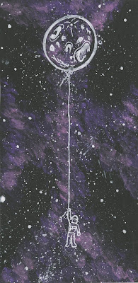
These were my two favourite designs for the portrait format. I really like the concept in the moon balloon because it communicates our attachment to space in a simple way and links to Carl Sagans idea that we are all made of star stuff. But I think I will be choosing the astronaut for this design because I think it has a stronger composition and is visually better, especially with the detailed background. I may reduce the design down to maybe one planet or even put some geometry in the background.

This rough version of the space background with the silhouettes is how I a going to create my final landscape editorial image. I want to have a more simple design for this and the other two more detailed. The idea for this is a nights sky from another planet and how the cosmos would look from the perspective of alien life. But before I make my final image I must first do some colour tests to see what will work best.
As I have decided that I will be using a space/cosmic texture in the background for my editorials, I thought that testings a range of colours would help me to visualise a better outcome. I have only ever used purple and pink to create these backgrounds so it has been very helpful to see these similar textures with different colours. I have also asked a range of people which colour they prefer and most said either green or yellow. I agree with these opinions because I think the higher contrast colours make a stronger background texture. I will be using what i have learned here in my final editorials.

Wednesday 19 October 2016

Studio Brief 1 Astronauts and Karl Kopinski

I have been following this Artist Karl Kopinski on Instagram for a while now and I have always admired his work and how he sketches his characters. He seems to do a lot of space themed/astronaut sketches so I figured he would be perfect to take reference from whilst studying the form of an astronaut. I may be drawing many astronauts over the corse of this project so I want to understand the  shapes more. 

I really like this sketch of an astronaut in a space craft. The unfinished line marks and washed pen gives the drawing more depth and a certain quality that I would like to incorporate into my designs.


Drawing an object on repeat for me is maybe the most effective way of understanding the astronauts form. I have done some continuous line drawings here not for detail but to capture the shapes and angles of an astronaut.

These are some more refined sketches of the astronauts. I am quite pleased with the outcome I think the shapes and angles of the space suit have been drawn quite well. however I have been focusing a lot on line within these sketches and whilst understanding the form is important I may need to reduce them down and maybe focus on a texture and shape rather than line.

Studio Brief 1 Idea generation


These are the first initial sketches and roughs for the Carl Sagan editorials. Here I am just gathering some ideas of what Sagan talks about Ranging from planets, universe, space travel and geometry which he says is the printed building block of our existence. Also as we are limited to two colours plus stock, this influences my designs and how I think about creating each illustration. 
These are also some roughs and thumbnail designs. I find that the more roughs I produce, the easier it is for me to finalised an image because I have much more to choose from and I like to combine different ideas and compositions to create the final image. Working with a range of formats also helps me to think in slightly different ways because it pushes me to think more about the composition of the image rather than just relying on other skills to create the image.

From researching Sagan I have discovered certain objects that I wouldn't have thought of including into my sketches such as the pioneer plaque and the geometry of the universe.

From the production process of the zine project, I realised that working on negative colours (white pen and black paper) is something that I would like to carry on into this editorial project. The fact that we only have a two colour limit also makes me want to do it more. I also think that the white on black has a certain minimal quality that works well with space created themes. Plus I have never really worked using negatives so I want to explore this type of aesthetic in more depth.

These initial roughs have been slightly refined to help me visualise the final image. I have focused on including some colour texture into the background to try and create a cosmic effect. I have also tried to simplify some designs down and focus more of the concept rather than detail like the image on the bottom right. Editorial illustration is about communication and sometimes the easiest way to communicate is through a simple idea or design.


Study task 1- Editorial illustration


Ive searched for some space related editorial illustrations to form a better understanding of how some modern illustrators would create a space themed design. I found Abduzeedo who creates these really simple yet creative illustrations using just black and white and simple compositions. 

I love this example of editorial illustration called 'Space Tourism' by Eva Bee. Although this brief only allows two colours I really like the way in which Eva Bee has created this image. It has both digital and hand drawn qualities. Although I don't plan on using digital for this project, it would be a good media to consider because a lot of editorial illustrations do have a very digital and neat quality. I also like this image for the communication and the story it tells. Its almost a joke on the fact that humans will explore the universe but still have our need for the material objects. 
This Illustration by Ana Yael really caught my eye with its dramatic composition that really plays with scale and depth. The character seems really small in the image and this sense of scale may be something I would like to explore in my editorials.

I also have acknowledged that editorial illustration is about communication, whether that be a person, a place a feeling or an idea. So I need to try and make my editorial illustration communicate my author Carl Sagan.


Studio brief 1 Zine final

This is the front and back cover for my Carl Sagan themed zine.
I wanted to keep the whole layout and format of the zine quite simple and symmetrical. So for the front and back cover of the zine is just a cropped image of the space texture that I have created.
This is the first double page of the zine. It is a full bleed of the space texture and it follows on from the front cover. I have chosen to do this space/cosmic texture in this zine because over summer i was experimenting alot with creating different space textures and it also works very well with Carl Sagan and his work.
I have tried to keep the zine symmetrical throughout all pages. So for this image I have focused on one moon/plannet. I have chose to do something different with this double page and use the negative colours to create a contrast. I figured the best way for me to create one image across the double page would to have the negative colours opposite creating this symmetrical form.
Carl Sagan talks alot about space travel and the potential to travel lightyears to distant galaxies in pursuit of finding alien life or another habitable planet. So I took this idea and added my own twist and designed a spaceship that could potentially take humans out of the Milkyway and into the unknown. 
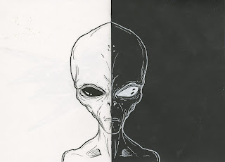
As Carl Sagan talks alot about the potential of extraterrestrial life. He said that it is a certainty that alien life does exist, I thought it would only be appropriate that I included this into my zine. Again I had the black and white double to work with so my aim was to keep the symmetry. This classic design of an alien is always visualised through the world and there may be a reason for this. Many people believe in an alien race called the greys and they are believed to look very similar to the alien I have drawn in the zine.

The grey aliens are also believed to have visited earth on numerous occasions. Although I haven't found anything from Carl Sagan believing in this I'm sure he would not dismiss the idea of alien life to have visited our planet.
To keep the same theme of space and the symmetrical aesthetics, I have chosen to have the last double page the same as the first. A full bleed of the cosmic space texture.
This is the crit feedback sheet. From reading through it seems that I have been given some good feedback, most people think it has been created in a very neat and tidy way.  People have also suggested that I could have digitally enhanced my images using photoshop, especially with the space texture. I will consider this when continuing to create more illustrations surround the author Carl Sagan.

Carl Sagan - Research and facts

The pioneer plaques are a pair of gold-anodised aluminium plaques that were placed on board the 1972 pioneer 10 and 1973 pioneer 11 spacecraft. These crafts were holding a pictorial message incase   the unlikely possibility that either of the pioneer 10/11 are intercepted by extraterrestrial life. The pectoral images show a nude male and female with symbols that indicate the location of earth. These space crafts are the first ever manmade objects to leave our solar system. These plaques have been designed in a way that would shield them from erosion by interstellar dust. Carl Sagan in an interview said that it is possible that these spacecrafts could be drifting in space for longer than the earth will exist. The original idea of a spacecraft carrying a message from mankind was first mentioned by Eric Burgess. He then approached Carl Sagan who had given multiple lectures about communication with extraterrestrial life.


Carl Sagan facts

Carl sagan was potentially the most beloved and respected american scientific visionary since Einstein. Both gifted astronomy researcher and communicator. He bought the wonders of the universe  to the masses with the popular TV show Cosmos and prize winning books - Dragons of eden and the pale blue dot.

The pale blue dot is a photograph of earth taken February 14 by the voyager 1 space probe from a record distance of 6 billion kilometres.
The Dragons of Eden:speculations of human intelligence - Carl Sagan combines the fields of anthropology, evolutionary biology, psychology and computer science to give a perspective on how human intelligence my have evolved.

"Look again at that dot. Thats here. Thats home. Thats us. On it everyone you love, everyone you know and everyone you have heard of, every human being who ever was, lived out their lives. The aggregate of our joy and suffering, thousands of religions, ideologies and economic doctrines, every hunter and forager, every hero and coward, every creator and destroyer of civilisation, every kind and peasant, every young couple in love, every mother and father, hopeful child, inventor and explorer, every teacher of morals, every corrupt politician, every "superstar"every supreme leader every saint and sinner in the history of our species has lived there - on a moat of dust suspended in a sunbeam"

- Carl sagan, 1934-1996

- Harvard passed on hiring Carl Sagan as a lecturer saying his work was needlessly wordy and useless.
- He dictated all of his work and writings to audio recorded logs.
- He considered writing a children's book called 'How do birds fly?'
- He did not like the space shuttle programme saying it was a false idea of space travel
- He was an early crusader against climate change, after studying venus's harsh climate, he argued that earth could reach the same fate.
- He wanted to legalise pot
- He thought Star Trek was too white and said a better representation would have been more culturally diverse.
- He said that we should leave mars alone and keep it preserved, although he was for space exploration he said that it would not be in our best interest to try and terraform and colonise mars.

"The nitrogen in our DNA, the calcium in our teeth, the iron in our blood, the carbon in our apple pies, we are made in the interiors of collapsing stars. We are made of star stuff."