final scene and page designs for book cover

This is the first page of book that sets the scene. It has been drawn using a range of thick and thin pens to create more depth to the drawing. The sky has been done using the dry brush technique I experimented with previously. I have also added some white highlights to bring out the contrast. The paper colour is a light grey tone which I think works well with giving it a gritty vibe. I was also able to get the perspective of the buildings accurate which automatically makes the scene more convincing. Im not to sure about how well the fine liner pen looks and it is what I said I wouldn't use but when the characters come into the story, the new media I have used will be introduced.

This scene is a drawing from a photo that I took when I went to the abandoned building in search for urban scenes and graffiti. When I was drawing these scenes I also had to think about the graffiti and what words or names would be typed/tagged onto the wall. I was listening to music while drawing majority of the scenes so I just sat back and listened to the song and when a word that worked well was mentioned, I used that as the tag. Such as 'Dark' 'Ghost' and haze. I think this was a good way to choose the words for the graffiti, just random and what what right at the time.

After the first double spread I decided to darken the tone of the background as if to give the impression that night time is now upon us. And this is where I have subtly introduced the characters as weird humanoid shaped silhouettes in the background with red eyes. I think this works well with the characters in the distance because it creates a lot of eeriness to the scene and is almost quite mysterious which is the vibe I am trying to achieve in the story.

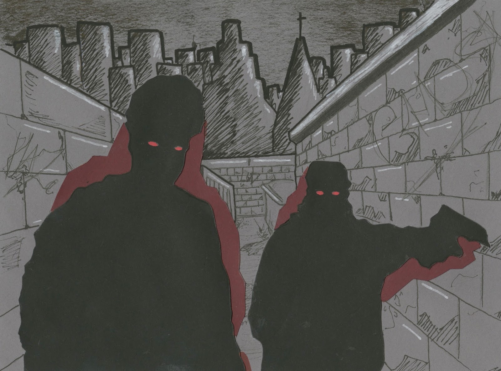
This scene is when the people have got closer and the shape becomes much more realistic and accurate. I think the red eyes work really effectively on the black, they pop out and make the figures look much scarier. I also decided to put the coloured shapes behind the characters burgundy which I think works well with the grey background and back silhouettes.
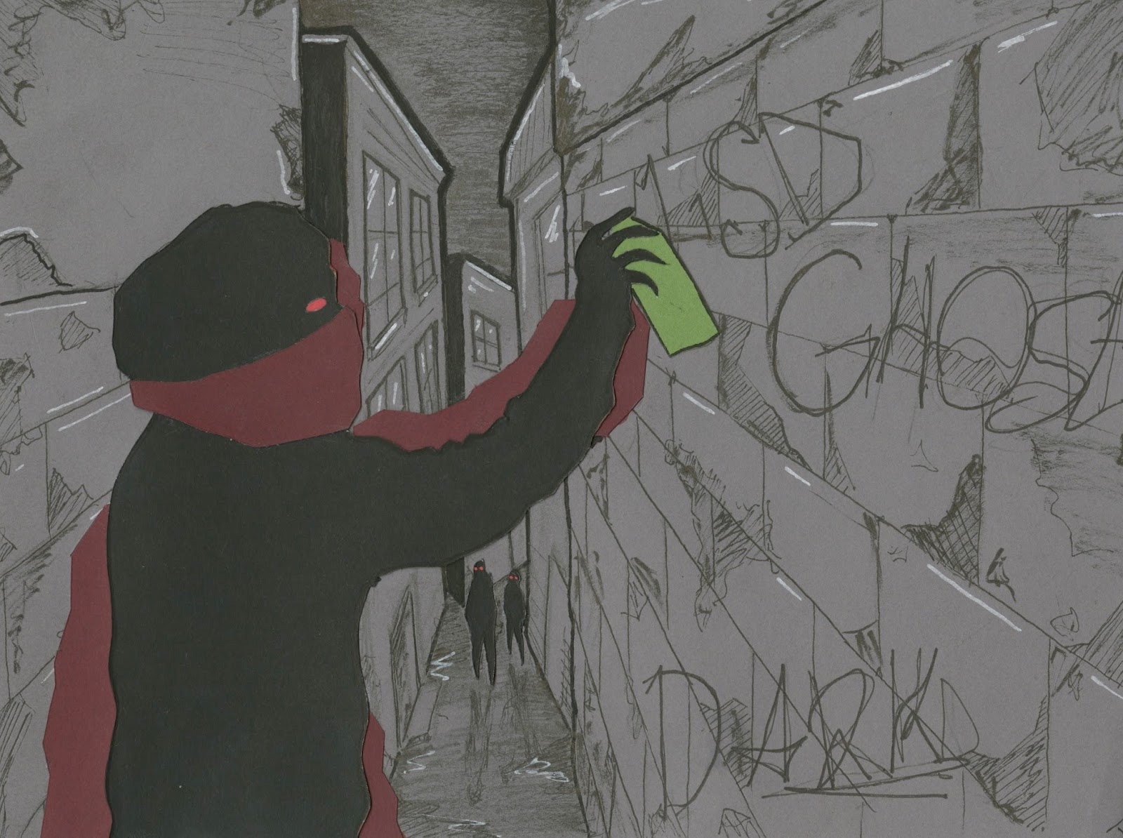
From the researched I gathered I thought it was appropriate to include a scene of someone spray painting on the wall. It keeps the idea of the gritty city running consistent throughout. I also like the black shapes in the background. I think without those subtle hints of characters in certain scenes, the book may look quite flat and boring. But the ghouls in the background add more depth to the page.

This scene is suppose to be a moment after the previous one and the spray painter has stopped spraying to look directly at the viewer and the people in the background have gotten closer. I have found it quite difficult to make the story in an obvious sequential order. Mine is bit more of a collection of individual scenes that tells brief and quite vague story. But the main focus of the narrative is the characters/Ghouls and I am happy in the way they are made from cut out shapes of paper. It provides each scene with a texture that can't be achieved by using paint or coloured ink.

This was one of the scenes I roughed out when testing the media. I wasn't going to include it but after speaking to friends and classmates, my decision was changed. I am glad I was persuaded in to it because this is one of my favourite scenes in the narrative. I think its just the weird shapes in the distance. I really think they elevate each scene.
This could be my favourite scene in the whole book. I just think the characters have a nice shape and the composition seems to work well with the background. Again this scene is one that was designed for the mock-up media test but with more attention to detail. I have also tried to keep the backdrops as consistent as possible to suggest its all part of the same journey through the city. I have also repeated the same graffiti tags throughout the narrative to show its all part of the same city/area that the person walks through. Consistency is quite vital throughout.
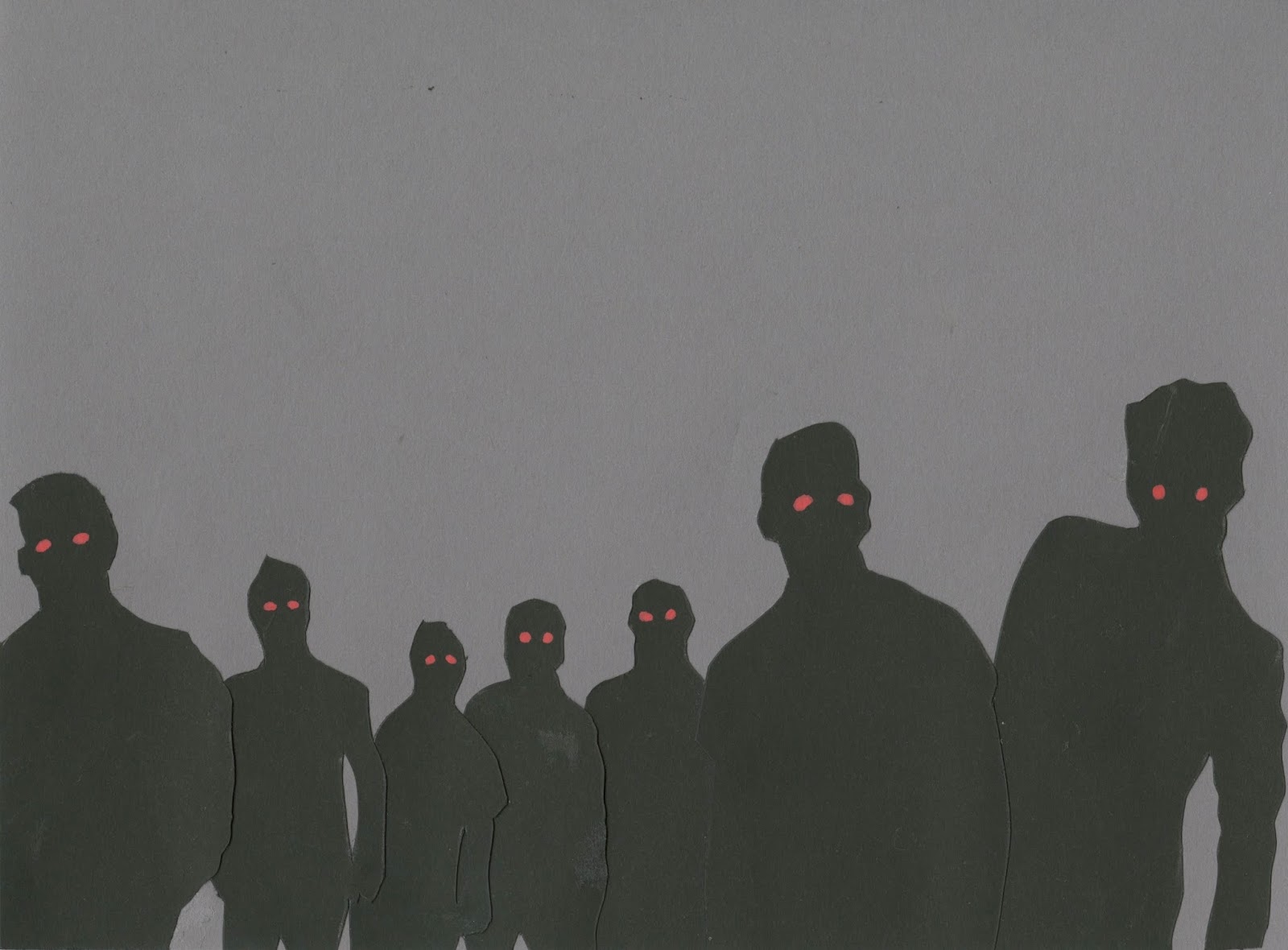

The two grey images above that is a double spread in the book that works quite nicely and gives a real sense that the person in the story is being surrounded by the ghouls. It has all be building up to this scenario. I have decided to leave out the background drawing for the last few pages because the setting for the scene and city has been placed and now the story is coming to a close the ghouls are the main focus. the person in the story who is experiencing this city can no longer see anything else but the the shapes and figures that are closing in on him. I almost prefer this without any background, I think I could have over done the detail in previous scenes and maybe should have just kept it simple.


This is the final double spread of the book. I ended it with the view that all of the ghouls have now closed in and they are completely in the viewers face. I also decided to use the burgundy colour shown throughout the shapes on the figures as the full bleed background. The colour change gives it an immediate change in the atmosphere. From the dark grey to the red tone almost makes it more serious and in ways represents blood. There isn't much of an ending for the character in the narrative but its almost down to the viewer to decides what happens next.


This is the front and back cover for the book. I designed this after doing the last two double spreads so I thought it would be appropriate to do it in the same way with no background. I particularly like the sense of depth that is shown with the black figures in the way they vary in size but still look in proportion and perspective with each other. This is a skill that I have developed throughout the project and think it is quite clear that my ability to do this has significantly improved. It feels like I am a step closer to developing my own unique style/visual signature. I chose to use a white background as creates contrast of the black figures and red eyes. It also gives the book bit of breathing space as the content within is really dark so I wanted to brighten it up but keep the same idea.


These are some photographs of the final picture book completed, printed and bound.

The book is on the table that has loads of illustrations and graffiti, almost in its fitting environment.
No comments:
Post a Comment