Friday 22 January 2016

End of Module Self Evaluation


over the course of this project I think I have definitely developed a range of practical skills and new ways to tackle briefs. firstly I think that the media I used for this project was something new to me and has been inspired by shape and texture tasks from visual language. This introduction of new uses of media into my practice is just what I need to really make my own work become more unique and individual. I have now come to realise that fine-liner pens are great but they are limited in there possibilities and thats where the experimentation of new media must be explored. It was very nice to produce work using the chosen media and I will definitely consider using a similar approach into future projects, but maybe get more experimental with different textures like the character that was drawn onto the wooden table. So I do believe that the things I have learnt over the course of this project in terms of making the artwork will be filtered into my own practice in some way.

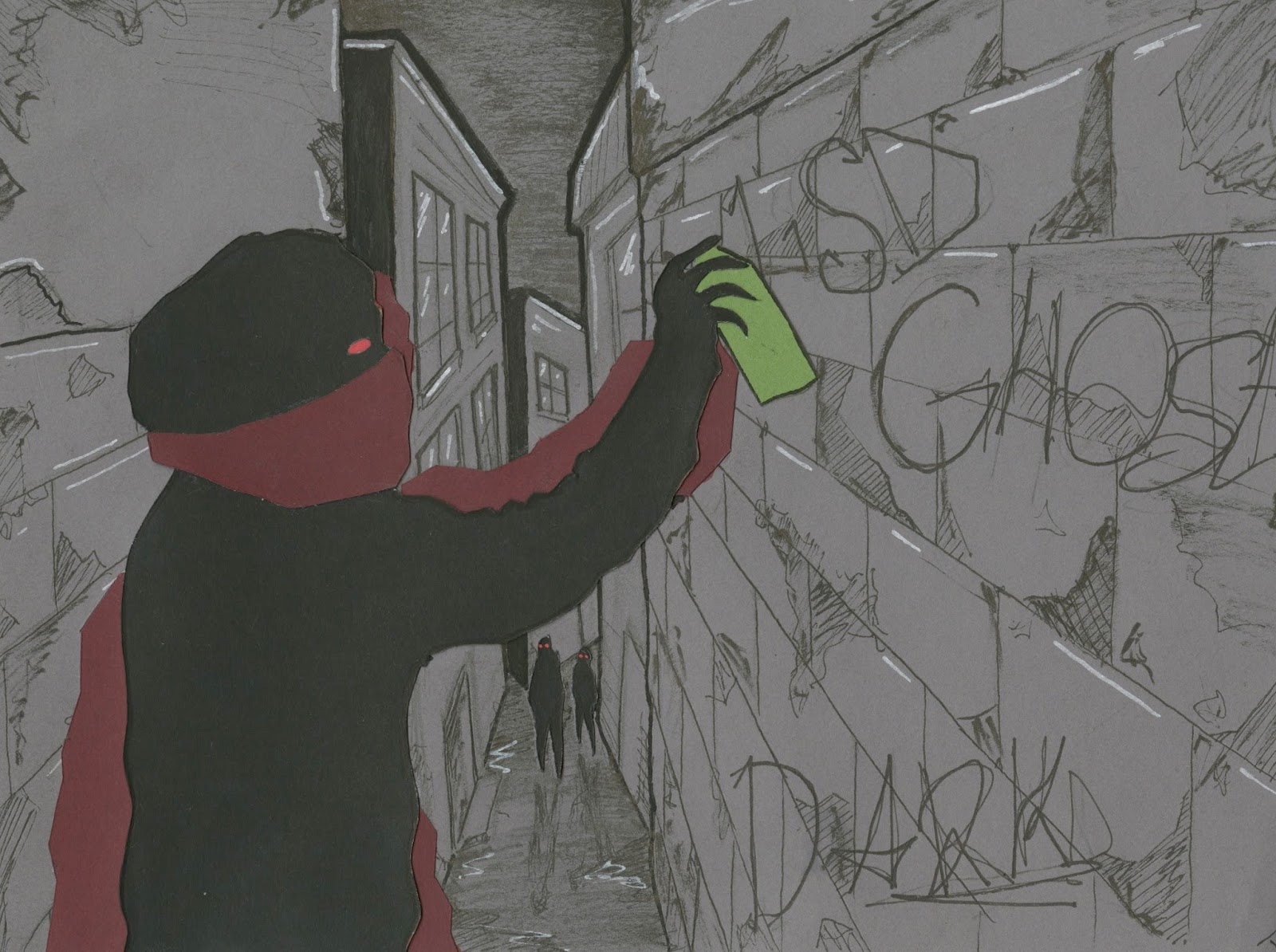
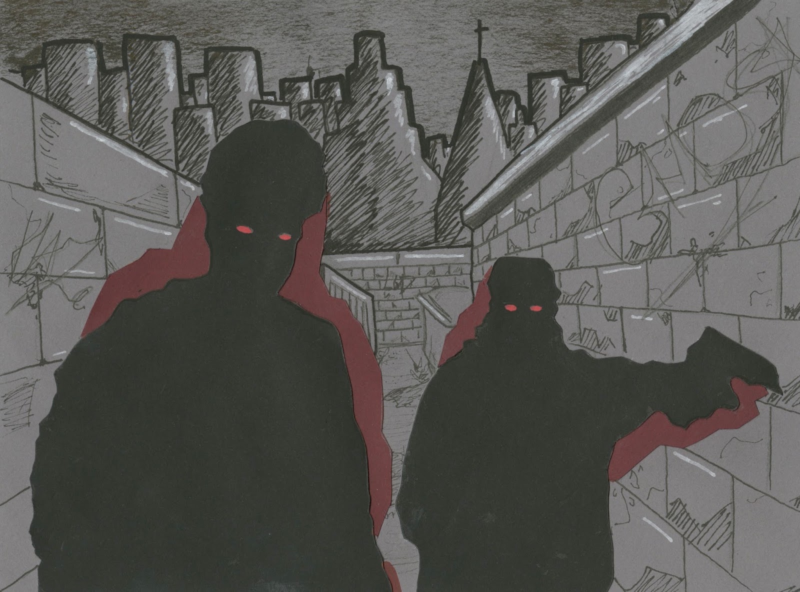
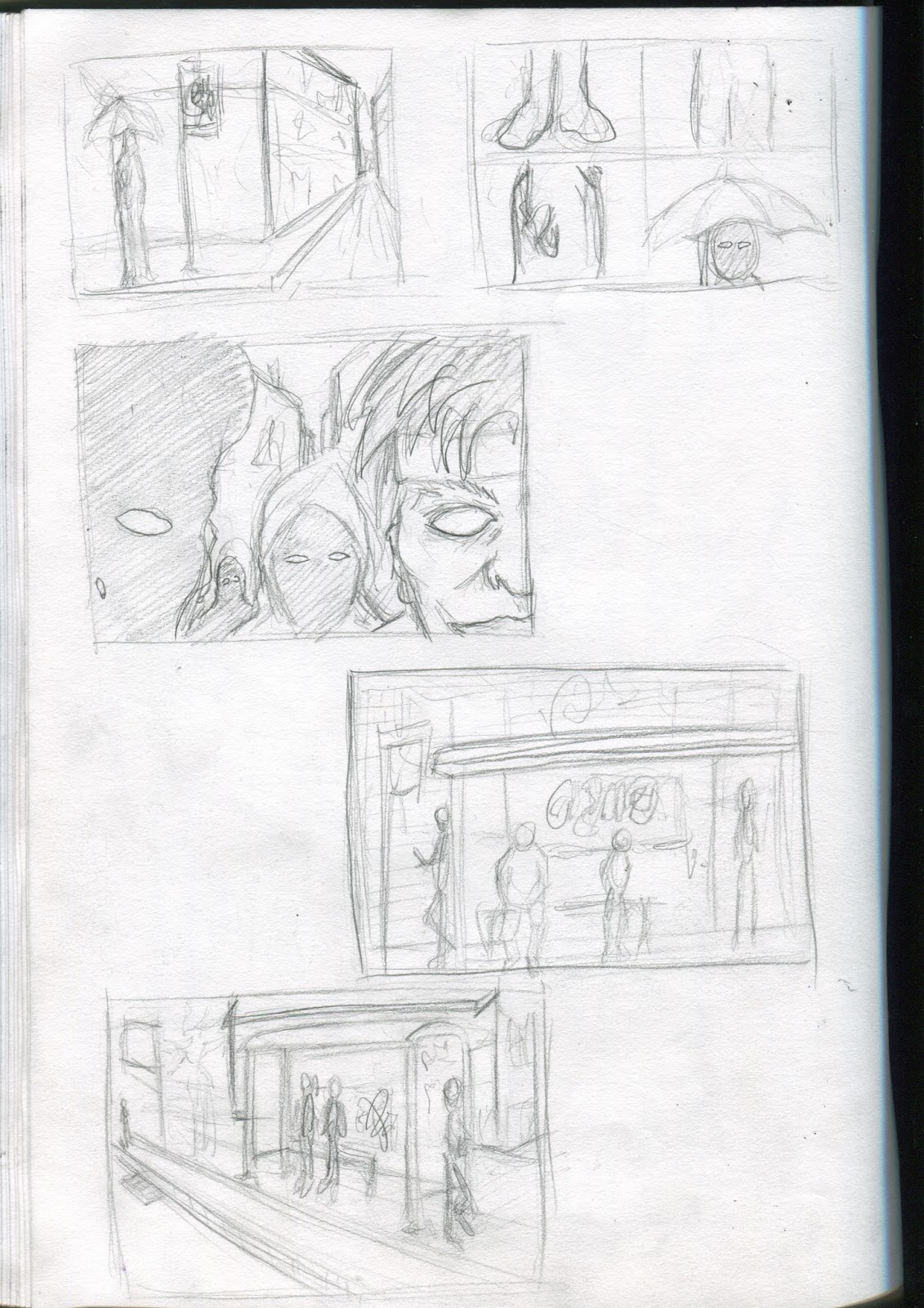
 I think the most important part of my research was the visual journalist section. Going out and collecting a range of first hand research and experience was vital for my project. Through the uses of observational drawings and gathering photographs of specific areas around the city, It made my project much easier to visualise and construct, whilst also giving me the necessary inspiration to include subtle hints to elevate areas of the book, such as the graffiti tags on the wall. I went out for a second research day to collect more images. I am now starting to understand that for a project to be truly innovative, the research and visual journalist section to a project should actually run the whole way through so I am constantly being updated with fresh ideas to increase the quality of my own practice. I also think the Artist research has played an important role during this project, because without the Joey Badass music video I probably wouldn't have illustrated the ghouls in the way I did. So I now know that to get the best kind of information to create a piece of illustration, one most go and experience something completely new.

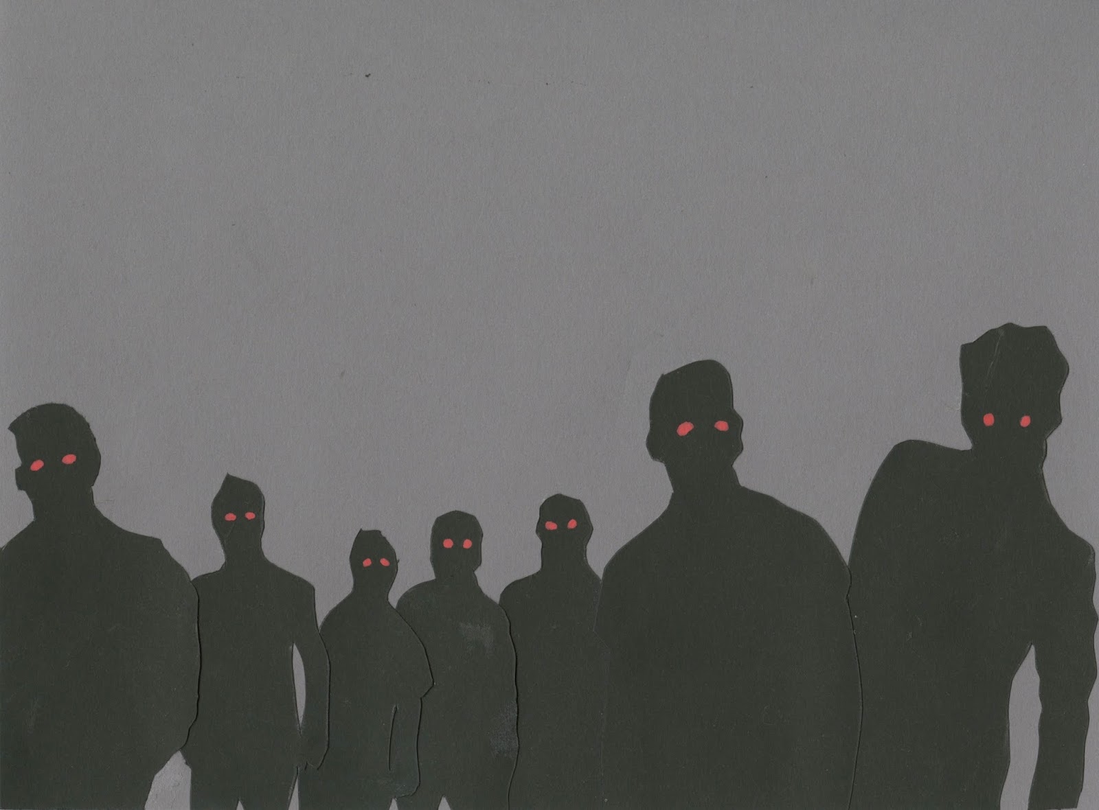
For me, I think the strengths of this project is the fact that I was able to explore a new type of media. I was actually very pleased with some pages in my book especially the last few double spreads and the front and back cover. Drawing people is probably one of my strongest traits at the moment so I capitalised on this strength and used it to my advantage within the project and based it on people. I just made all of the drawings silhouettes instead so the shape is all that can be identified. I also think the overall concept for the book could be seen as a strength but the concept may not be too clear to the viewer. The concept being that the zombies and ghouls in the narrative are intact just ordinary people who have become a slave to the system of modern society. I am trying to bring the things I think about the world and society into my own practice which I think could be seen as a strength in itself.

Each area of my project could have been improved in ways. I could have explored more areas of leeds and taken more photos for inspiration. I could have done more experimental tests with media and use of colour. I only had one sketchbook filled when I could have done more. Im not saying I didn't do enough for this project but I know that I can Always do more. But each brief is helping me think is this way which its making me 
become much more dedicated to my own practice and is bringing me to focus on how I can improve in all areas of illustration. So for future reference, I will be willing to put as much effort into each project as I can.

For this project, a lot of decision making has been made when I have been using my sketchbook to develop and wrestle with certain ideas. A lot of my decision making has been quite spontaneous in the way I saw the 'Unorthodox' music video and was immediately inspired to tackle my work in a whole new way. So I think some of my decisions made during this project has definitely elevated my work and the way I will now approach future tasks.

 I honestly do think I could have managed my time slightly better with some aspects of this project. I should have been more consistent with blogging throughout and I should have found the time to experiment more with certain medias such as digital software like photoshop and illustrator. But personally I think that the christmas break put my project at a stand still for a while and it was hard to get back into the momentum of work. The three week break was a long time and if that time was spent at college, I would have had the motivation to produce a lot more work for the book. I am still pretty pleased with my final outcome and I feel like this project has developed my skills more than any so far, so thats a bonus in itself. I now look forward to future briefs with a more open mind.

7.How would you grade yourself on the following areas: 
(please indicate using an ‘x’)  

5= excellent, 4 = very good, 3 = good, 2 = average, 1 = poor

1 2 3 4 5
Attendance

x


Punctuality

x


Motivation


x


Commitment


x


Quantity of work produced

x


Quality of work produced


x


Contribution to the group

x


The evaluation of your work is an important part of the assessment criteria and represents a percentage of the overall grade. It is essential that you give yourself enough time to complete your written evaluation fully and with appropriate depth and level of self-reflection. If you have any questions relating to the self-evaluation process speak to a member of staff as soon as possible.


Visual Narrative - Image references

These are a few samples of some image references that I used to help me create some of the scenes in my narrative. The main thing I used them for was to get the body shape for the silhouette ghouls. 


This shows how I used the image and then changed it into the style character that is suited to fit my narrative. I only used image references on the characters that are more so in the foreground and not the background.


Visual narrative finals

final scene and page designs for book cover
This is the first page of book that sets the scene. It has been drawn using a range of thick and thin pens to create more depth to the drawing. The sky has been done using the dry brush technique I experimented with previously. I have also added some white highlights to bring out the contrast. The paper colour is a light grey tone which I think works well with giving it a gritty vibe. I was also able to get the perspective of the buildings accurate which automatically makes the scene more convincing. Im not to sure about how well the fine liner pen looks and it is what I said I wouldn't use but when the characters come into the story, the new media I have used will be introduced.

 This scene is a drawing from a photo that I took when I went to the abandoned building in search for urban scenes and graffiti. When I was drawing these scenes I also had to think about the graffiti and what words or names would be typed/tagged onto the wall. I was listening to music while drawing majority of the scenes so I just sat back and listened to the song and when a word that worked well was mentioned, I used that as the tag. Such as 'Dark' 'Ghost' and haze. I think this was a good way to choose the words for the graffiti, just random and what what right at the time.
After the first double spread I decided to darken the tone of the background as if to give the impression that night time is now upon us. And this is where I have subtly introduced the characters as weird humanoid shaped silhouettes in the background with red eyes. I think this works well with the characters in the distance because it creates a lot of eeriness to the scene and is almost quite mysterious which is the vibe I am trying to achieve in the story.
This scene is when the people have got closer and the shape becomes much more realistic and accurate. I think the red eyes work really effectively on the black, they pop out and make the figures look much scarier. I also decided to put the coloured shapes behind the characters burgundy which I think works well with the grey background and back silhouettes. 
From the researched I gathered I thought it was appropriate to include a scene of someone spray painting on the wall. It keeps the idea of the gritty city running consistent throughout. I also like the black shapes in the background. I think without those subtle hints of characters in certain scenes, the book may look quite flat and boring. But the ghouls in the background add more depth to the page.
This scene is suppose to be a moment after the previous one and the spray painter has stopped spraying to look directly at the viewer and the people in the background have gotten closer. I have found it quite difficult to make the story in an obvious sequential order. Mine is bit more of a collection of individual scenes that tells brief and quite vague story. But the main focus of the narrative is the characters/Ghouls and I am happy in the way they are made from cut out shapes of paper. It provides each scene with a texture that can't be achieved by using paint or coloured ink.
 This was one of the scenes I roughed out when testing the media. I wasn't going to include it but after speaking to friends and classmates, my decision was changed. I am glad I was persuaded in to it because this is one of my favourite scenes in the narrative. I think its just the weird shapes in the distance. I really think they elevate each scene.
This could be my favourite scene in the whole book. I just think the characters have a nice shape and the composition seems to work well with the background. Again this scene is one that was designed for the mock-up media test but with more attention to detail. I have also tried to keep the backdrops as consistent as possible to suggest its all part of the same journey through the city. I have also repeated the same graffiti tags throughout the narrative to show its all part of the same city/area that the person walks through. Consistency is quite vital throughout.
The two grey images above that is a double spread in the book that works quite nicely and gives a real sense that the person in the story is being surrounded by the ghouls. It has all be building up to this scenario. I have decided to leave out the background drawing for the last few pages because the setting for the scene and city has been placed and now the story is coming to a close the ghouls are the main focus. the person in the story who is experiencing this city can no longer see anything else but the the shapes and figures that are closing in on him. I almost prefer this without any background, I think I could have over done the detail in previous scenes and maybe should have just kept it simple. 
This is the final double spread of the book. I ended it with the view that all of the ghouls have now closed in and they are completely in the viewers face. I also decided to use the burgundy colour shown throughout the shapes on the figures as the full bleed background. The colour change gives it an immediate change in the atmosphere. From the dark grey to the red tone almost makes it more serious and in ways represents blood. There isn't much of an ending for the character in the narrative but its almost down to the viewer to decides what happens next.

This is the front and back cover for the book. I designed this after doing the last two double spreads so I thought it would be appropriate to do it in the same way with no background. I particularly like the sense of depth that is shown with the black figures in the way they vary in size but still look in proportion and perspective with each other. This is a skill that I have developed throughout the project and think it is quite clear that my ability to do this has significantly improved. It feels like I am a step closer to developing my own unique style/visual signature. I chose to use a white background as creates contrast of the black figures and red eyes. It also gives the book bit of breathing space as the content within is really dark so I wanted to brighten it up but keep the same idea.
 These are some photographs of the final picture book completed, printed and bound.

The book is on the table that has loads of illustrations and graffiti, almost in its fitting environment.

Visual Narrative - Roughs and storyboarding

I think I have now collected enough research for my project to be taken to the next stage. I have taken inspiration from various different sources to create the atmosphere, tone and story for my narrative. I have also got the set media I will be using to design my final pages for the book. The next step for me now is to start to bring my ideas together and sketch out the scenes of my story so I will be able to visualise how it will all start coming together.

 These are a few initial roughs I have done to see what format my book will be. After seeing the portrait sketches compared to the cut-out mockups that was inspired by the video 'Unorthodox' I now realise that my book will look better at a landscape format. I feel that it will make it easier to fit more characters and people into the scenes which is one of the most important part of my narrative. So the format I have decided on is landscape because it will compliment the style more and will work best to show the grittiness of the inner city. The dimensions I have chosen is 200mm wide x150mm high. Choosing the dimensions for this book needs to be done before I start roughing out the scenes so I will know exactly how to compose each final design when looking through the roughs.


More roughs for the potential scenes of the narrative and the SubDub event. After speaking to Tutors and friends in the class I have decided to not include the SubDub night into the narrative. I will however taking the concept of people being zombie-like at 5am into the story, I just won't include a club scene into the narrative as the story itself is more focused on the city and the people so a club will just divert the story and can make it slightly confusing.
Now I have the dimensions I am going to use for my book, it has made it a lot easier to sketch out scenes. I had a thought of including a some pigeons in the narrative and creating them in the same way the people will be, silhouettes with red eyes. Because pigeons are regularly found in cities and they are quiet dirty birds and have connotations that work well with a city setting,  it may be worth having them on a page or two.

I have thought to include a person/character spray painting the walls. It only makes sense as there will be graffiti on the walls in pretty much every scene in the book. I also like the idea of people just casually stood at a bus stop but are stills done in the ghoul style. I think there is something ominous about the idea of the characters just going about there every day life but at the same time are portrayed as zombies/ghouls. I also am going to end the story where the person is completely surrounded by the ghouls and throughout is almost a build up to the last scene.

I am aiming to design 12 pages of content and the front and back cover of the book. I have chosen to do 12 because I think that is enough to get viewer to understand the atmosphere and the idea of the narrative, also this will all be done using media I haven't used before and it will take a long time to complete each scene. The page above on the left is a guide for me on how the double spread pages are going to look. It is quite difficult to bring it all together and tell a sequential story that follows the narrative. Ive just been trying to sketch my out of problems.

This is a rough of a scene for the narrative. I am aiming to set the scene with the story and have the first double spread without any characters in but it automatically lets the viewer know what kind of environment the narrative is set in. There will be graffiti on the walls and the building will look derelict and abandoned. This instantly sets the mood for the rest of the book which is obviously quite dark and scary. After the research and roughs I have done and with the time I have got left to complete the project, it is now time to start crafting the final designs for the book.

Thursday 21 January 2016

Mock-up poster for book

 For this task we each had to produce a mock-up poster that would give the viewer a brief introduction to what our narrative will entail. 

For this I just did a load of random doodles of things that I have figured out within the research of my project such as the graffiti, people in perspective, zombie-like characters and the silhouette figures. I did all of these in pencil but the real version will be made from coloured cut paper.
At first I thought this small task was quite pointless but it did intact help me see how the narrative will work once I had a page that is filled with the collected ideas of my project so far.

Further research and image references

Now my project has taken a turning point, especially with the media, I thought that now is a good time to go and get some more research/reference imagery. My plan was to go out and get some photographs of some gritty locations that would have lots of graffiti. My friend who knows the city better than I do took me to this location that is perfect for helping me set the scene of my narrative.
 This was a narrow river that is completely covered with graffiti tags along the walls. Its just what I need to bring a more urban atmosphere.
This was a tag that I thought looked nice with the orange brick at the top and the stone wall at the bottom. I think Graffiti looks best when done on a brick wall so I will include graff and tags on the walls within my book.

The place we went to was abandoned so it did help me to visualise some of the scenes for my narrative. I might even use some of these photos to work from for the backgrounds of my book.
On the way back from the trip we made to the abandoned area that was covered with graffiti, I saw some workers painting back over some street art. It made me laugh and I had to get a photograph.
I also walked past a church on the way back and I liked the victorian/gothic look it has. I may add a church in my narrative as churches can sometimes be portrayed in a dark way which can work well with my story.


research and inspiration - Project turning point

Hip hop is my favourite music genre and I listen to it basically every day. I have recently been listening to a young rapper named Joey Badass from New York and I stumbled across one of his music videos called 'UNORTHODOX'. The second I seen this video I knew that I wanted to pursue my narrative from a different angle. The animated video that has inspired my project was Directed by Coodie & Chike from Creative Control, the video takes the audience on an illustrated journey through the cold streets of Brooklyn. The way that the video has been animated is by using hundreds of still images over the original scenes, and filled in with random shapes and textures of the people and objects from the video.
All of these images below are screenshots I have taken from the unorthodox music video.
The way the characters (Joey and his friends) have been illustrated in some of the scenes are sinister looking figures and would work perfectly with my narrative, the story I am trying to tell and its setting. I also like the black silhouette shapes of the figures with the white and red eyes. It gives the video a very gritty atmosphere which is exactly what I am trying to achieve with my book. It gives the impression that they are ghoul-like people/creatures.


The characters look almost like demons in some of the still frames.

After watching the music video, I immediately decided to try and create my own scenes within the same style but instead of doing it all digitally like how it is in the video, I wanted to play around with some cut out paper and card to see if it would get a similar effect. I think that it was quite successful and I think the black shapes work very well with the red eyes. I now know what media I will be using to create all of my book which is quite a big deal for me because in previous projects I have always just accepted that I will be doing it in black and white using only pen and pencils. Thats about to change.

This is another test I did for the characters in my narrative using black ink and posa paint pens. I think the paint pens work well with creating the coloured shapes behind the figures and the red eyes with the drips. But it also looks quite flat and still when compared to the cut out paper version. I used a dry brush with black ink to get the grainy texture for the background which I thinks work quite effectively so I may use this technique in some of the scenes of my narrative to create a texture which has a gritty feeling.


This is one of the characters drawn onto a table using black ink and post pens. The table itself is filled with lots of illustrations done by me and a few of my friends, its like our own group task. I thought it was necessary to put one of the characters from my narrative onto it. Also it was nice to draw on something that isn't paper or card, the table is wooden and has a rough surface that works well with certain styles. I left a part of the characters afro the texture of the table and I think it works well. It will be hard to achieve that kind of approach in my narrative as it will all be done with cut out paper. but I intend on experimenting with different textures like this in future projects.

This was a collage piece I did as part of a visual language task and I think it does relate to my narrative in the way the eyes of the characters have been coloured. I am now starting to try and link the things I do in the visual language tasks with my main projects. This is a good step for me because the visual language tasks help me to break out of the usual way I work, put me out of my comfort zone and pushes me to experiment with more media.