Wednesday 28 October 2015

Line and mark making

For this study task we have to produce 20 line drawings within the chosen theme. Line is one of the monst important parts of drawing and illustration. Line can be intrinsically beautiful meaning that it has beauty within itself. This can be achived in a number of ways such as jesture and minimalism, by reducing embellishment, line can communicate an idea or image in a unique way. For this take we must explore a range of line mark making tools to create alternative atmospheres within the drawings.
For this task I am challenging myself and trying to use no pencil lines and just create my drawing with inc. I am tying to move away from the feathered way of markmaking and produce more jestural and organic lines. This will really help improve the quality of my drwing. 

I have found that drawing the same object multiple times, with different uses of media really helps me understand the shapes and form of the object. This means that the more I draw the object the more naturally my lines will become more confident and jestural.   


I have started using the Brushpen for my line drawings and this is completely new to me. I am really enjoyong the ability to be able to create at different texture and thickness of line by adding more pressure to the page. I think that if I continue to work in this way, my mark making abiities will progress at a much faster rate than if I was to just draw with pencil.

Continuous line drawing is also a very effective way of mark making. It is actually becoming one of my favourte ways to draw, especially when drawing people. With a continous line drawing you must be confident with each direction you move the pen. It is a very minimal way of drawing and can sometimes be challenging to get all of the needed features without taking the pen off the paper or over complicating the drawing.
From all of the mark making methods I explored and the clowns that I drew, this was almost a final piece for the short task we were given. I was very pleased with this drawing as it is a completely new way of mark making for me and I think it was successful. Simple lines can be very effective in a drawing and as you can see there are no areas that have include tone, so I had to consider the composition of each character before the marks were made and this can be difficult without guidlines. I think I am going to continue to draw in this style as I believe it will help me progress as an illustrator faster than doing detailed pencil drawings.


Chosen theme

For this task we were told to select a specific given theme and simply produce 4 drawings that directly relate to the topic. The theme that i decided to chose was initially mythical beasts.
This is a drawing of the mythical beast known as Predator. I was happy with the outcome of this drawing as alot of time was put into the small details within the face. But after drawing this i realised that i wanted to take a different direction with my theme as mythical beasts and monsters is something that i have done in the past and i want to challenge myself with something i havent done before. 
Funfairs and Circus is the theme i am going to be persuing in this visual language exploration. The reason i have chosen this theme is because i believe there is much more i can learn from it in the sense that it has more depth than mythical beasts and a wider range of objects to study. Also studying the human form is a personal task of mine and i can include that within the theme of clowns.


Wednesday 21 October 2015

Typology - Final Design + Evaluation


This is a rough of the final piece on A4 format. I have done this because without considering the layout, it would be very difficult to fit all the images onto the A2 poster format which it has to be presented on. By doing this I have a reference on the placement of each image on the page and also the scale of the image.

This is the final A2 illustrated typology poster on the theme of ''Spiritual connections'

I was pleased with my final outcome on this project. I particularly liked the concepts that I created for certain letters such as: fourth dimensional travel; astral projection; genesis creation; connected consciousness. As the theme that I chose included such abstract ideas it was a challenge for me to visualise them, however I think that I produced some interesting concepts. Although it proved difficult, the theme is something that I am personally very interested in and therefore I had the motivation to explore lots of different ideas. If I could change anything about my final outcome I would have spent more time on the title and considered the typography more; I have realised the impact that lettering can have on the overall result. I would also have used a different media. If colour was allowed to be used I would have liked to use watercolours to create a psychedelic theme throughout the piece, I would not have been able to achieve this effect with one colour and therefore decided to do it in monochrome. In future I would like to spend more time developing each individual idea further however the timescale given made it difficult.


Typology - Research + Development

After exploring the different themes I had chosen to illustrate, along with a peer critique session, I decided to further develop the theme of spiritual connections. I feel that this subject is the most personal to me and what I believe as an individual. This theme also has the possibility to be interpreted in many ways as there is depth behind each design. Just being sat in the studio working around peers, some of the concepts for the letters would spark a very interesting conversation. This is what I was trying to achieve with this theme; a thought provoking experience for the audience. 
'Creation of Adam' - This is a very famous religious painting by Michaelangelo and for the letter 'G' I have created a parody of this iconic image and named it 'Genesis Creation'.
A quick sketch of the parody version of Creation of Adam. The hand that would initially be Gods has been changed to an aliens hand as if to suggest we have been created by extra-terrestrial life. I was happy with this idea because it addresses something that is widely considered throughout many cultures across the world but has been portrayed  in a more commercial way. 
This is some image reference I found on the internet for the letter 'A'. It is an image of astral projection which is an out of body experience (OBE) that anyone can achieve by reaching a certain state of consciousness which is similar to a meditative state.
This was my design for the concept of astral projection. In my previous ideas for this design I had found it difficult to get the right and angle and perspective to show that the spirit was leaving the body, therefore I was pleased with this design which I think captures that idea effectively. 


Further sketches and roughs of some designs and concepts for each letter of the alphabet. Some of these ideas including: connected consciousness; fourth dimensional travel; wisdom and energy.


Friday 16 October 2015

A-Z Typology themes

For this project our aim is to design and create an A-Z poster of typology, meaning we must have an image (vignette) for each letter of the alphabet from any theme of our choice. Before we do this, we must first explore a wide range of themes in order to develop our skills and to adress a specific theme that exisits in the world and illustrate this as a relateable topic. I have personally enjoyed doing this brief because it has pushed me to be more loose with some of my sketches and not to always worry about refining a drawing. Sometimes the idea is more important than the drawing.


 Faces
For this theme i decided to focus on drawing nothing but faces. The drawings i have done on these two pages consist of both drawings from observation and imagination. From the second we are born we are constantly surrounded by human faces and our brains are programmed into creating faces in many things and objects, this is known as 'brain simulation software'. For this theme i have tried to recreate this human instinct of creating faces in everything we see.


Fictional Characters

 This theme of fictional characters speaks for itself, each letter of the alphabet is an iconic fictional character including Batman, Gollum, Yoda and Darth Vader. I enjoyed drawing these characters but i chose to quickly move to the next theme because i felt like i wasnt adressing any kind of concept that exists in the world, i was just drawing characters that already exist, although some of these drawing may look appealing there is no depth to the theme.


Religion

This theme i have decided to illustrate is religion. I have brielfy touched upon some aspects that religion can influence such as God, Demons and spirituality. I quite like this theme as there is alot that can come from it as it has alot of depth and can reach out to many people across the world, but it has proved to be difficult to find something that relates to religion for each letter of the alphabet.


The Random

This theme i decided to explore is simply an A-Z of random objects and things that exist in the world. There is not much of a meaning behind this theme and every drawing is of something that is completely random, but the theme for this poster is to make people laugh and is more of a novelty than anything else, also my skills can develop over a wide range by drawing as many different objects as possible.

Human Addictions

humans by nature have very addictive personalities, whether it be drugs or something simple like sugar. Most people especially in the western world have some sort of an addiction. I have chosen to explore this idea for my poster as i think it is an interesting topic that many people can relate to. I can adress many negative aspects in regards to what humans are addicted to such as Iphones, Alcohol and fast foods, as there arnt that many positive things that humans become addicted to.


Spiritual connections


This is my favourite theme that i have decided to explore. Spirituality is such a deep and diverse concept that can be percived in many different ways but is also completely relevant to every human that walks on this planet. In this A-Z i have explored a very wide range of meaningful concepts such and life and death, astral projection (outer body experience), connected conciousness and even psychedelics. Of all the themes i have explored this is the one i will most likely be taking forward for further development for my A-Z poster of typology.


Wednesday 7 October 2015

Royal Armouries observational drawing

Today we took a trip to the Royal Armouries for a session of observational drawings. From our previous observational drawing day i realised I was immediately drawn to the human form and figure so the Armouries was a great place for me to draw from life. The drawings below are all from manakin figures that have been assembled in specific poses so i had alot of time to work out the proportoins and perspective of each character. However although drawing static forms is a great way to refine my figure drawings, it is restricting as the movement cannot be fully captured.


Tuesday 6 October 2015

Observational City Drawing


We took afield trip to the university and the park to draw objects and people from observation.

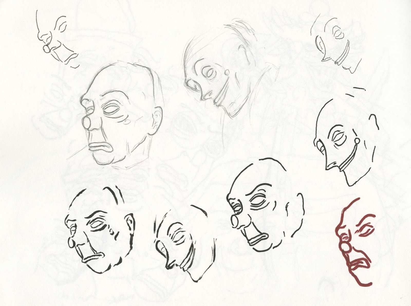
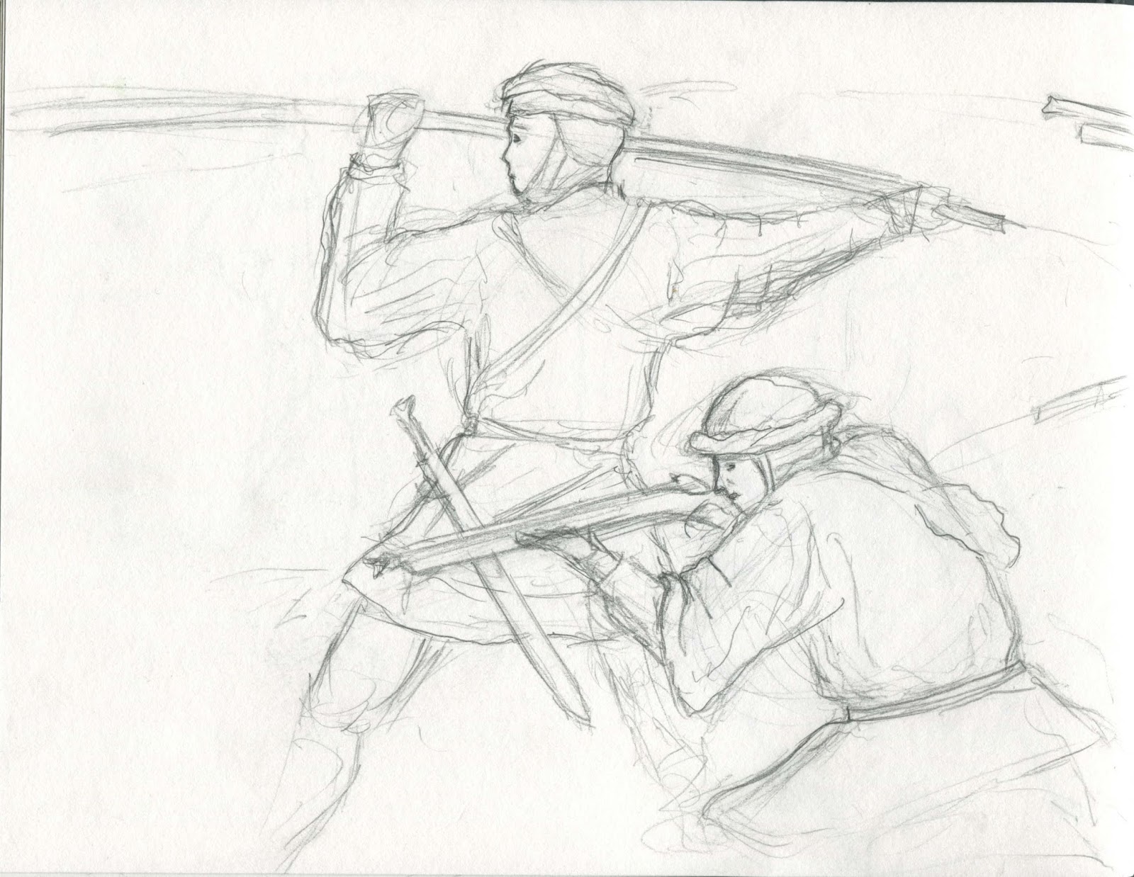
Scanning the area i choose to draw people and the human form as i feel this was the best way to capture the motion and movement of that particular moment. I really enjoyed this exercise because i never usually draw in this way and I feel I have learned a great deal about drawing the human shape and form. I struggled to use a range of media within my sketches and chose to only use pen and pencil, but now I know I must be willing to explore different media and materials in order to get a more diverse way of mark making. To conclude I will continue to study and draw the human form from observational drawing as it is a great way to develop my skills.
This is a line drawing of a person sat on a park bench. this drawing had to be done as quickly as possible to capture the form. when doing observational drawing i found it is always best to keep your eyes on the object rather than the drawing.

Line drawing of a classmate doing some observational sketches.


This was my favourite drawing of the day, I was walking down a busy street in the city centre and I noticed that there were many people in my sight, so i seized the opportunity and was drawing these people whilst walking behind them. I feel like i captured the moment in this drawing more so than any of the others.